📋文章目录
- 复现目标图片
- 绘图前期准备
- 绘制左侧回归线图
- 绘制右侧散点图
- 组合拼图 (关键步骤!)
跟着「Nature」正刊学作图,今天挑战复现Nature文章中的一张组合图–左边为 回归曲线、右边为 散点图。这种组合图在展示相关性和分组效应时非常清晰有力。
复现目标图片
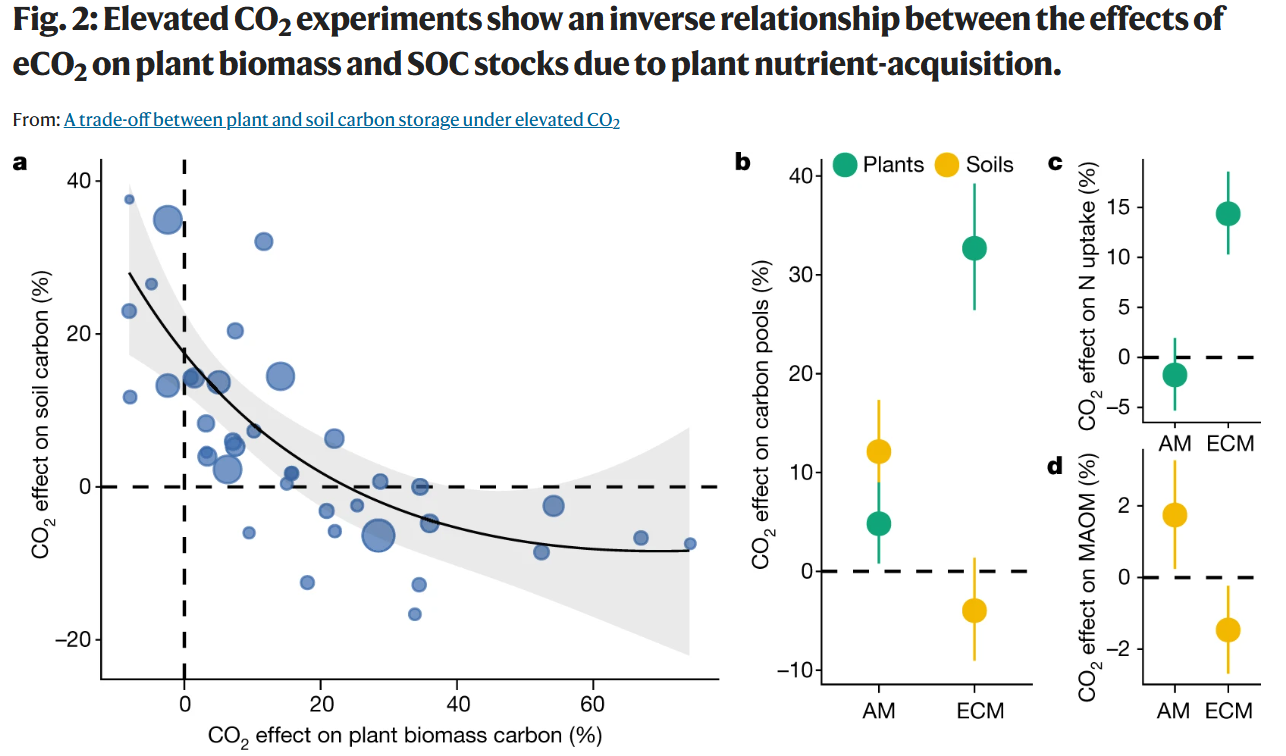
图注:Nature原文中的组合图 (来源 https://www.nature.com/articles/s41586-021-03306-8)
图注:使用R ggplot2 + cowplot复现的效果
绘图前期准备
rm(list = ls())
setwd(dirname(rstudioapi::getActiveDocumentContext()$path))library(openxlsx);library(ggplot2);library(cowplot)data<- purrr::map(1:6, ~read.xlsx("data.xlsx", .x))
# 读取数据:6个子图的数据分别存储在data.xlsx的6个sheet中
data <- purrr::map(1:6, ~read.xlsx("data.xlsx", .x))
# <-- 补充说明开始 -->
# 提示:如需练习数据,可通过文末方式联系获取。
# 这里用map循环读取,保证每个子图数据独立存储,便于后续清晰调用。
# <-- 补充说明结束 -->
绘制左侧回归线图
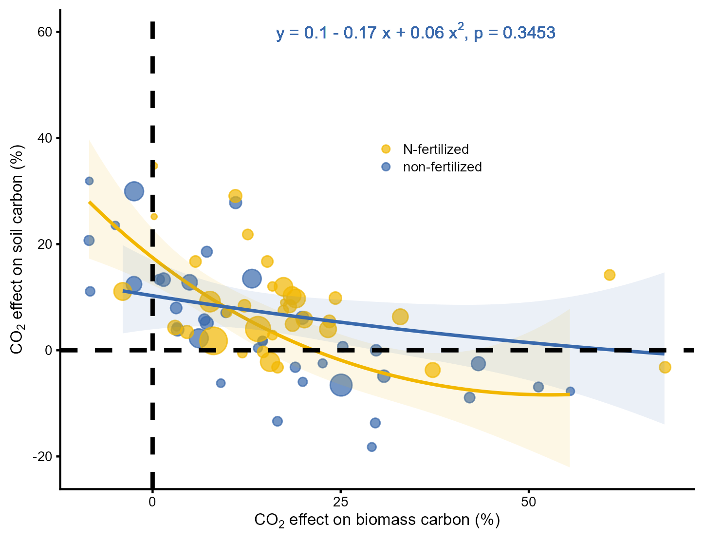
Lineplot<- ggplot(data[[1]], aes(Biomass*100, yi*100))+geom_point(aes(size = 1/vi, col = Treatment, fill = Treatment), alpha = 0.7)+#设置点的大小geom_line(aes(Biomass*100, yhat), data[[2]], col = "#F2B701", size = 0.8)+geom_ribbon(aes(x = Biomass*100, y = yhat, ymax = UCL, ymin = LCL),data[[2]], fill = "#F2B701", alpha = 0.1, size = 0.8)+#绘制置信区间geom_line(aes(Biomass*100, yhat), data[[3]], col = "#3969AC", size = 0.8)+#拟合曲线geom_ribbon(aes(x = Biomass*100, y = yhat, ymax = UCL, ymin = LCL),data[[3]], fill = "#3969AC", alpha = 0.1, size = 0.8)+scale_size(range = c(1, 6))+scale_color_manual(values = c("#F2B701","#3969AC"))+scale_fill_manual(values = c("#F2B701","#3969AC"))+geom_hline(yintercept = 0, lty=2, size = 1)+ geom_vline(xintercept = 0, lty=2, size = 1)+guides(size = "none")+theme_cowplot(font_size = 8)+#将字号设置为8theme(legend.position = c(0.5,0.7),legend.box = 'horizontal',legend.title = element_blank(),plot.margin = unit(c(5,5,5,5), "points"))+geom_text(aes(35, 60, label =(paste(expression("y = 0.1 - 0.17 x + 0.06 x"^2*", p = 0.3453")))),parse = TRUE, size = 3, color = "#3969AC")+#填入公式labs(x = expression(paste(CO[2], " effect on biomass carbon (%)")),y = expression(paste(CO[2], " effect on soil carbon (%)")))Lineplot
绘制右侧散点图
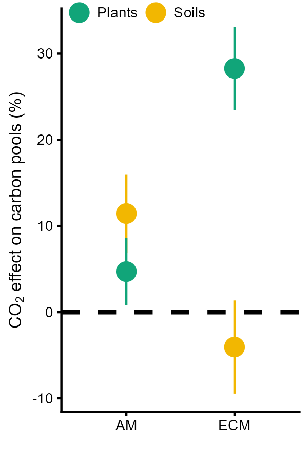
Myco<- ggplot(data[[4]], aes(Mycohiza, estimate*100, color = group, group = group))+geom_hline(yintercept = 0, lty = 2, size = 1)+ scale_color_manual(values = c("#11A579", "#F2B701"))+geom_pointrange(aes(ymin = ci.lb*100, ymax = ci.ub*100), position = position_dodge(width = 0), size = 0.8)+ theme_cowplot(font_size=8) +theme(legend.title = element_blank(),legend.direction = "horizontal",legend.position = c(0, 0.99))+labs(x = "",y = expression(paste(CO[2], " effect on carbon pools (%)")))Myco
Nutake<- ggplot(data[[5]], aes(Mycohiza, estimate*100)) + geom_hline(yintercept = 0, lty=2, size=1) + geom_pointrange(aes(ymin = ci.lb*100, ymax = ci.ub*100), size = 0.8, color = "#11A579")+theme_cowplot(font_size=8) +theme(legend.position = "none",axis.title.y = element_text(margin = margin(r=1)))+labs(x = "",y = expression(paste(CO[2]," effect on N-uptake (%)")))Nutake
MAOM<- ggplot(data[[6]], aes(Mycohiza, estimate*100))+ geom_hline(yintercept = 0, lty = 2, size = 1)+ geom_pointrange(aes(ymin = ci.lb*100, ymax = ci.ub*100),size = 0.8, color = "#F2B701")+theme_cowplot(font_size = 8) +theme(legend.position = "none",axis.title.y = element_text(margin = margin(r=1)))+labs(x = "",y = expression(paste(CO[2]," effect on MAOM (%)")))MAOM
组合拼图 (关键步骤!)
Right<- plot_grid(Nutake + theme(plot.margin = unit(c(5, 5, -10, 5), "points")),MAOM + theme(plot.margin = unit(c(0, 5, 5, 5), "points")),nrow = 2, labels = c("c","d"), align = "v", axis = "l",vjust = 1.2, hjust = 0.5, label_size = 10)#先拼接右侧上下两张图
Midrig<- plot_grid(Myco + theme(plot.margin = unit(c(5,5,5,0), "points")),Right,vjust = 1.2,axis = "b",labels = c("b",""), label_size = 10,rel_widths = c(1, 0.7),nrow = 1, ncol = 2)#拼接所有的散点图
Total<- plot_grid(Lineplot, middleright,vjust = 1.2, axis = "b", labels = c("a",""), label_size= 10,rel_widths = c(1, 0.7))#拼接左侧的回归曲线图Total
图注:拼图完成!关键点在于使用plot.margin微调子图间距,以及rel_widths控制左右比例。
复现完成! 总结一下关键点:
-
数据组织:清晰分隔不同子图所需数据。
-
回归图:geom_ribbon画置信区间,size=1/vi实现加权散点。
-
点估计图:geom_pointrange是核心,position_dodge处理分组错位。
-
拼图:cowplot::plot_grid是核心,精调plot.margin和rel_widths是成败关键。


系统上安装 MuJoCo)


——变分自编码器详解与实现)


![[AI-video] 数据模型与架构 | LLM集成](http://pic.xiahunao.cn/[AI-video] 数据模型与架构 | LLM集成)


