文章目录
- 专栏导读
- 功能预览
- 快速开始
- 核心实现拆解
- 1. 背景与基础布局
- 2. 背景层静态星空(轻微闪烁)
- 3. 前景层“亮晶晶”的闪烁小星星
- 4. 交互与动效
- 5. 行星装饰
- 可配置项与个性化建议
- 初始化顺序(入口)
- 源码
- 结语
专栏导读
🔥🔥本文已收录于《30天学习Python从入门到精通》
🉑🉑本专栏专门
针对于零基础和需要重新复习巩固的同学所准备的一套基础班教学,从0基础到精通Python,轻松掌握Python,欢迎各位同学订阅,专栏订阅地址:点我直达
🤞🤞此外如果您已工作,如需利用Python解决办公中常见的问题,欢
迎订阅《Python办公自动化》专栏,订阅地址:点我直达
-
本文基于项目文件 ,带你快速拆解并实现一个具有星空背景、星星闪烁、鼠标视差与点击涟漪特效的炫酷首页。全文只有一个 HTML 文件,结构清晰、易于拓展。
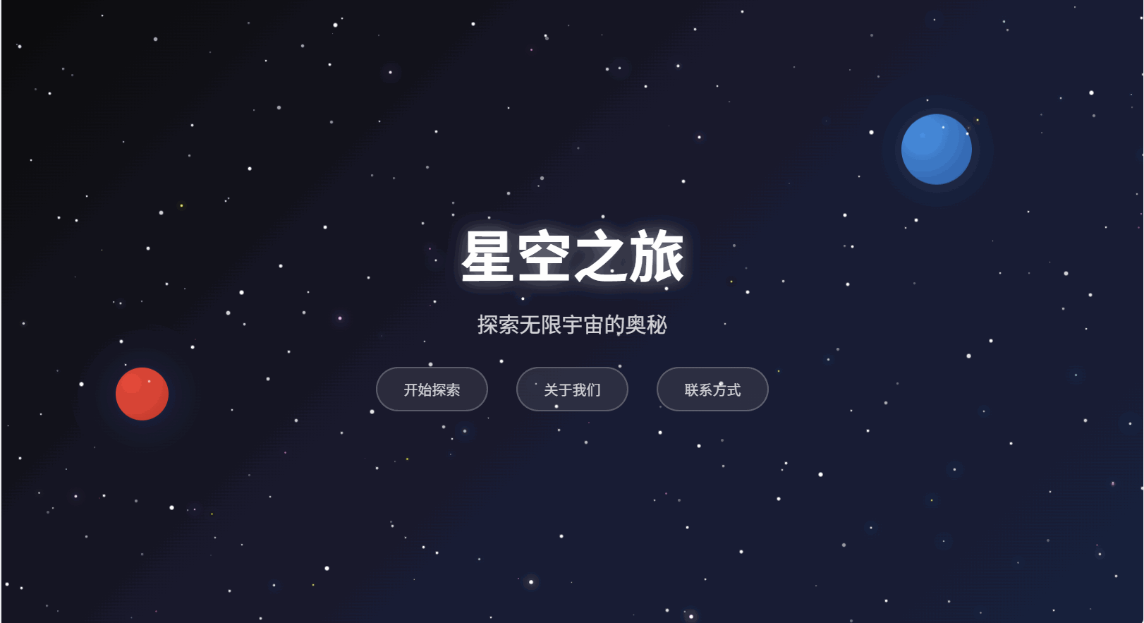
功能预览
-
星空背景与漂浮行星装饰
-
两层星空:
- 背景层静态星星(轻微闪烁)
- 前景层“随机小星星一闪一闪亮晶晶”(多色柔光小星星,节奏随机)
-
鼠标移动产生轻微视差效果
-
点击任意位置出现涟漪特效
-
响应式布局与现代 UI 风格按钮
快速开始
-
目录结构(单文件):
1-炫酷星空首页/
└── index.html
-
本地预览(任选其一):
-
直接双击打开 index.html
-
或在该目录启动本地服务器并访问 http://localhost:8000/
核心实现拆解
1. 背景与基础布局
-
使用渐变背景营造深邃的宇宙氛围:
body {height: 100vh;background: linear-gradient(135deg, #0c0c0c 0%, #1a1a2e 50%, #16213e 100%);overflow: hidden;font-family: 'Arial', sans-serif;
}
-
两层主要容器:
- .starfield:底层静态星星
- .shooting-stars:前景闪烁小星星(已无流星动画,仅承载“亮晶晶”)
2. 背景层静态星空(轻微闪烁)
CSS:
.star { position: absolute; background: white; border-radius: 50%; animation: twinkle 2s infinite alternate; }
@keyframes twinkle { 0% {opacity: .3; transform: scale(1);} 100% {opacity: 1; transform: scale(1.2);} }
JS 生成:
function createStars(){const starfield = document.getElementById('starfield');const numStars = 200;for(let i=0;i<numStars;i++){const star = document.createElement('div');star.className='star';const size = Math.random()*3+1;star.style.cssText = `width:${size}px;height:${size}px;left:${Math.random()*100}%;top:${Math.random()*100}%;`;star.style.animationDelay = Math.random()*2+'s';star.style.animationDuration = (Math.random()*3+2)+'s';starfield.appendChild(star);}
}
3. 前景层“亮晶晶”的闪烁小星星
- 多色小星星样式(蓝/白/黄/粉,带柔和光晕):
.twinkling-star{position:absolute;border-radius:50%;animation:sparkle ease-in-out infinite;background: radial-gradient(circle,#fff 0%,#87ceeb 60%,transparent 100%);} /* 默认蓝调 */
.twinkling-star.color-blue{box-shadow:0 0 10px #87ceeb,0 0 20px rgba(135,206,235,.5);}
.twinkling-star.color-white{background:radial-gradient(circle,#fff 0%,#f0f8ff 60%,transparent 100%);box-shadow:0 0 8px #fff,0 0 16px rgba(255,255,255,.4);}
.twinkling-star.color-yellow{background:radial-gradient(circle,#fff 0%,#ffd700 60%,transparent 100%);box-shadow:0 0 8px #ffd700,0 0 16px rgba(255,215,0,.4);}
.twinkling-star.color-pink{background:radial-gradient(circle,#fff 0%,#ff69b4 60%,transparent 100%);box-shadow:0 0 8px #ff69b4,0 0 16px rgba(255,105,180,.4);}
@keyframes sparkle{0%,100%{opacity:.3;transform:scale(.8);filter:brightness(1);}25%{opacity:.8;transform:scale(1.2);filter:brightness(1.5);}50%{opacity:1;transform:scale(1.4);filter:brightness(2);}75%{opacity:.6;transform:scale(1.1);filter:brightness(1.2);} }
- 生成与节奏微调:
function createTwinklingStars(){const container = document.getElementById('shooting-stars');const count = 80; // 调整数量const colors = ['color-blue','color-white','color-yellow','color-pink'];for(let i=0;i<count;i++){const s = document.createElement('div');s.className = 'twinkling-star ' + colors[Math.floor(Math.random()*colors.length)];const size = Math.random()*2+1; // 1-3pxs.style.cssText = `width:${size}px;height:${size}px;left:${Math.random()*100}%;top:${Math.random()*100}%`;s.style.animationDuration = (Math.random()*2+1.5)+'s';s.style.animationDelay = (Math.random()*3)+'s';container.appendChild(s);}
}
function updateTwinklingRhythm(){document.querySelectorAll('.twinkling-star').forEach(s=>{const size = Math.max(1, Math.min(3, (parseFloat(s.style.width)|| (Math.random()*2+1)) + (Math.random()*0.6-0.3)));s.style.width=size+'px'; s.style.height=size+'px';s.style.animationDuration=(Math.random()*2+1.2)+'s';s.style.animationDelay=(Math.random()*2)+'s';});setTimeout(updateTwinklingRhythm, 3000 + Math.random()*2000);
}
效果:多色小星遍布全屏,大小/节奏轻微起伏,呈现“亮晶晶”的律动感。
4. 交互与动效
-
鼠标视差:
document.addEventListener('mousemove', e=>{const stars = document.querySelectorAll('.star');const mx=e.clientX/window.innerWidth, my=e.clientY/window.innerHeight;stars.forEach((st,i)=>{const speed=(i%5+1)*0.5; st.style.transform=`translate(${(mx-.5)*speed}px, ${(my-.5)*speed}px)`;});
});
-
点击涟漪:
document.addEventListener('click', e=>{const ripple=document.createElement('div');ripple.style.cssText = `position:absolute;left:${e.clientX}px;top:${e.clientY}px;width:0;height:0;border:2px solid rgba(135,206,235,.6);border-radius:50%;transform:translate(-50%,-50%);animation:ripple 1s ease-out;pointer-events:none;z-index:100;`;document.body.appendChild(ripple); setTimeout(()=>document.body.removeChild(ripple),1000);
});
/* 补充关键帧 */
@keyframes ripple{0%{width:0;height:0;opacity:1;}100%{width:100px;height:100px;opacity:0;}}
5. 行星装饰
通过两个绝对定位的圆形渐变块制造“远处行星”的氛围,并加轻微浮动动画:
.planet{position:absolute;border-radius:50%;background:radial-gradient(circle at 30% 30%,#4a90e2,#2c5aa0);box-shadow:0 0 50px rgba(74,144,226,.3);animation:float 6s ease-in-out infinite;}
@keyframes float{0%,100%{transform:translateY(0)}50%{transform:translateY(-20px)}}
可配置项与个性化建议
- 星星数量:createTwinklingStars 中的
count(默认 80) - 星星大小:生成时的
size以及 sparkle 动画中的 scale 值 - 闪烁节奏:
animationDuration与animationDelay的随机范围 - 颜色风格:
colors数组可自由增删(如全蓝、冷白、金黄等) - 移动端优化:
- 适当降低星星数量与发光强度
- 避免同时叠加过多阴影层
小提示:当前文件中保留了一个针对 .meteor 的 will-change 性能提示样式(来源于早期“流星”版本),仅作为示例存在,不影响当前效果。如需更严谨可改成对 .twinkling-star 使用 will-change。
初始化顺序(入口)
createStars();          // 背景层:静态星空(微微闪烁)
createTwinklingStars(); // 前景层:多色小星(亮晶晶)
updateTwinklingRhythm();// 周期性细微调整,增强灵动感
源码
<!DOCTYPE html>
<html lang="zh-CN">
<head><meta charset="UTF-8"><meta name="viewport" content="width=device-width, initial-scale=1.0"><title>炫酷星空首页</title><style>* {margin: 0;padding: 0;box-sizing: border-box;}body {height: 100vh;background: linear-gradient(135deg, #0c0c0c 0%, #1a1a2e 50%, #16213e 100%);overflow: hidden;font-family: 'Arial', sans-serif;}.starfield {position: absolute;top: 0;left: 0;width: 100%;height: 100%;z-index: 1;}.star {position: absolute;background: white;border-radius: 50%;animation: twinkle 2s infinite alternate;}@keyframes twinkle {0% { opacity: 0.3; transform: scale(1); }100% { opacity: 1; transform: scale(1.2); }}.twinkling-star {position: absolute;background: radial-gradient(circle, #ffffff 0%, #87ceeb 60%, transparent 100%);border-radius: 50%;animation: sparkle ease-in-out infinite;}.twinkling-star.color-blue {background: radial-gradient(circle, #ffffff 0%, #87ceeb 60%, transparent 100%);box-shadow: 0 0 10px #87ceeb, 0 0 20px rgba(135, 206, 235, 0.5);}.twinkling-star.color-white {background: radial-gradient(circle, #ffffff 0%, #f0f8ff 60%, transparent 100%);box-shadow: 0 0 8px #ffffff, 0 0 16px rgba(255, 255, 255, 0.4);}.twinkling-star.color-yellow {background: radial-gradient(circle, #ffffff 0%, #ffd700 60%, transparent 100%);box-shadow: 0 0 8px #ffd700, 0 0 16px rgba(255, 215, 0, 0.4);}.twinkling-star.color-pink {background: radial-gradient(circle, #ffffff 0%, #ff69b4 60%, transparent 100%);box-shadow: 0 0 8px #ff69b4, 0 0 16px rgba(255, 105, 180, 0.4);}@keyframes sparkle {0%, 100% { opacity: 0.3; transform: scale(0.8); filter: brightness(1);}25% {opacity: 0.8;transform: scale(1.2);filter: brightness(1.5);}50% {opacity: 1;transform: scale(1.4);filter: brightness(2);}75% {opacity: 0.6;transform: scale(1.1);filter: brightness(1.2);}}.content {position: relative;z-index: 10;display: flex;flex-direction: column;justify-content: center;align-items: center;height: 100vh;text-align: center;color: white;}.title {font-size: 4rem;font-weight: bold;margin-bottom: 1rem;text-shadow: 0 0 20px rgba(255, 255, 255, 0.5);animation: glow 2s ease-in-out infinite alternate;}@keyframes glow {from { text-shadow: 0 0 20px rgba(255, 255, 255, 0.5); }to { text-shadow: 0 0 30px rgba(135, 206, 235, 0.8), 0 0 40px rgba(135, 206, 235, 0.6); }}.subtitle {font-size: 1.5rem;margin-bottom: 2rem;opacity: 0.8;animation: fadeInUp 1s ease-out 0.5s both;}@keyframes fadeInUp {from {opacity: 0;transform: translateY(30px);}to {opacity: 0.8;transform: translateY(0);}}.nav-buttons {display: flex;gap: 2rem;animation: fadeInUp 1s ease-out 1s both;}.nav-btn {padding: 12px 30px;background: rgba(255, 255, 255, 0.1);border: 2px solid rgba(255, 255, 255, 0.3);color: white;text-decoration: none;border-radius: 30px;transition: all 0.3s ease;backdrop-filter: blur(10px);}.nav-btn:hover {background: rgba(135, 206, 235, 0.2);border-color: rgba(135, 206, 235, 0.6);box-shadow: 0 0 20px rgba(135, 206, 235, 0.4);transform: translateY(-2px);}.shooting-stars {position: absolute;top: 0;left: 0;width: 100%;height: 100%;z-index: 5;}.planet {position: absolute;border-radius: 50%;background: radial-gradient(circle at 30% 30%, #4a90e2, #2c5aa0);box-shadow: 0 0 50px rgba(74, 144, 226, 0.3);animation: float 6s ease-in-out infinite;}@keyframes float {0%, 100% { transform: translateY(0px); }50% { transform: translateY(-20px); }}</style>
</head>
<body><div class="starfield" id="starfield"></div><div class="shooting-stars" id="shooting-stars" aria-hidden="true"></div><div class="planet" style="width: 80px; height: 80px; top: 20%; right: 15%; animation-delay: -2s;"></div><div class="planet" style="width: 60px; height: 60px; bottom: 30%; left: 10%; animation-delay: -4s; background: radial-gradient(circle at 30% 30%, #e74c3c, #c0392b);"></div><div class="content"><h1 class="title">星空之旅</h1><p class="subtitle">探索无限宇宙的奥秘</p><div class="nav-buttons"><a href="#" class="nav-btn">开始探索</a><a href="#" class="nav-btn">关于我们</a><a href="#" class="nav-btn">联系方式</a></div></div><script>// 创建星星function createStars() {const starfield = document.getElementById('starfield');const numStars = 200;for (let i = 0; i < numStars; i++) {const star = document.createElement('div');star.className = 'star';const size = Math.random() * 3 + 1;star.style.width = size + 'px';star.style.height = size + 'px';star.style.left = Math.random() * 100 + '%';star.style.top = Math.random() * 100 + '%';star.style.animationDelay = Math.random() * 2 + 's';star.style.animationDuration = (Math.random() * 3 + 2) + 's';starfield.appendChild(star);}}// 创建随机闪烁小星星function createTwinklingStars() {const container = document.getElementById('shooting-stars');const count = 80; // 可按需调整数量const colors = ['color-blue', 'color-white', 'color-yellow', 'color-pink'];for (let i = 0; i < count; i++) {const star = document.createElement('div');star.className = 'twinkling-star ' + colors[Math.floor(Math.random() * colors.length)];const size = Math.random() * 2 + 1; // 1 - 3pxstar.style.width = size + 'px';star.style.height = size + 'px';star.style.left = Math.random() * 100 + '%';star.style.top = Math.random() * 100 + '%';// 每颗星星不同节奏star.style.animationDuration = (Math.random() * 2 + 1.5) + 's'; // 1.5 - 3.5sstar.style.animationDelay = (Math.random() * 3) + 's';container.appendChild(star);}}// 周期性轻微随机改变闪烁星星的节奏和大小,增强“亮晶晶”效果function updateTwinklingRhythm() {const stars = document.querySelectorAll('.twinkling-star');stars.forEach((star) => {// 轻微调整大小和时长const size = Math.max(1, Math.min(3, (parseFloat(star.style.width) || (Math.random()*2+1)) + (Math.random()*0.6 - 0.3)));star.style.width = size + 'px';star.style.height = size + 'px';star.style.animationDuration = (Math.random() * 2 + 1.2) + 's';star.style.animationDelay = (Math.random() * 2) + 's';});setTimeout(updateTwinklingRhythm, 3000 + Math.random() * 2000);}// 鼠标移动效果document.addEventListener('mousemove', (e) => {const stars = document.querySelectorAll('.star');const mouseX = e.clientX / window.innerWidth;const mouseY = e.clientY / window.innerHeight;stars.forEach((star, index) => {const speed = (index % 5 + 1) * 0.5;const x = (mouseX - 0.5) * speed;const y = (mouseY - 0.5) * speed;star.style.transform = `translate(${x}px, ${y}px)`;});});// 初始化// 初始化createStars();
+        createTwinklingStars();
+        updateTwinklingRhythm();// 添加少量持续拖尾粒子效果const trailStyle = document.createElement('style');trailStyle.textContent = `.meteor {will-change: transform, opacity, filter;}.meteor::before, .meteor::after {will-change: transform, opacity;}`;document.head.appendChild(trailStyle);// 添加点击特效document.addEventListener('click', (e) => {const ripple = document.createElement('div');ripple.style.position = 'absolute';ripple.style.left = e.clientX + 'px';ripple.style.top = e.clientY + 'px';ripple.style.width = '0px';ripple.style.height = '0px';ripple.style.border = '2px solid rgba(135, 206, 235, 0.6)';ripple.style.borderRadius = '50%';ripple.style.transform = 'translate(-50%, -50%)';ripple.style.animation = 'ripple 1s ease-out';ripple.style.pointerEvents = 'none';ripple.style.zIndex = '100';document.body.appendChild(ripple);setTimeout(() => {document.body.removeChild(ripple);}, 1000);});// 添加涟漪动画const style = document.createElement('style');style.textContent = `@keyframes ripple {0% {width: 0px;height: 0px;opacity: 1;}100% {width: 100px;height: 100px;opacity: 0;}}`;document.head.appendChild(style);</script>
</body>
</html>
结语
-
至此,一个炫酷、灵动且可扩展的“星空首页”就完成了。你可以继续添加导航、介绍区块、滚动内容,或更换主题色与动效参数,打造你的专属宇宙。欢迎在 的基础上自由改造与二次创作!
-
希望对初学者有帮助
-
致力于办公自动化的小小程序员一枚
-
希望能得到大家的【一个免费关注】!感谢
-
求个 🤞 关注 🤞
-
此外还有办公自动化专栏,欢迎大家订阅:Python办公自动化专栏
-
求个 ❤️ 喜欢 ❤️
-
此外还有爬虫专栏,欢迎大家订阅:Python爬虫基础专栏
-
求个 👍 收藏 👍
-
此外还有Python基础专栏,欢迎大家订阅:Python基础学习专栏


![PWM波的频谱分析及matlab 验证[电路原理]](http://pic.xiahunao.cn/PWM波的频谱分析及matlab 验证[电路原理])

 :编译、安装和测试)


(贪心算法))
)


![[langchain] Sync streaming vs Async Streaming](http://pic.xiahunao.cn/[langchain] Sync streaming vs Async Streaming)

)


