在阅读本文前,最好先看看WPF——自定义RadioButton
背景
WPF中实现单选功能通常有两种方案:
- RadioButton组:传统方案,但代码冗余
- ListBox定制:通过样式改造,兼顾数据绑定和UI灵活性
需求
一组选项中,选中某个选项(选项需要横向排列,同时选中效果与未选中效果要能明确显示),就将这个选项的值写入到后端。
设计选型
RadioButton方案
通过RadioButton来实现,是肯定可行的,
但是对于一组RadioButton,需要设置组名;
同时每个RadioButton在Checked时都要触发事件,也需要为它们设置相应的事件,不利于后台绑定:也就是说要将选中值写入VM比较麻烦,因为所有的都需要实现;
并且还存在一个问题,所有RadioButton需要手动去设置相应的显示内容,不能使用一个集合以便于管理。
ListBox方案
通过ListBox也是可行的,只是它就需要进行一些改造了,因为ListBox默认的是纵向排列,同时它没有一个明确的选中与未选中效果;
但是它可以绑定集合,同时通过自定义,可以比较轻松的将选中值写入到VM中;或者通过item的选中事件即可将选中值写入到VM中。
方案对比
| 方案 | 代码量 | 数据绑定 | 布局灵活性 | 维护成本 |
|---|---|---|---|---|
| RadioButton组 | 高 | 困难 | 低 | 高 |
| ListBox定制 | 中 | 简单 | 高 | 低 |
后续基于ListBox进行实现。
实现
样式定义
<Style x:Key="RadioListBoxStyle" TargetType="{x:Type ListBox}"><!-- 基础样式继承原有ListBoxStyle1 --><Setter Property="Background" Value="{StaticResource ListBox.Static.Background}" /><Setter Property="BorderBrush" Value="{StaticResource ListBox.Static.Border}" /><Setter Property="BorderThickness" Value="1" /><Setter Property="Foreground" Value="{DynamicResource {x:Static SystemColors.ControlTextBrushKey}}" /><Setter Property="ScrollViewer.HorizontalScrollBarVisibility" Value="Auto" /><Setter Property="ScrollViewer.VerticalScrollBarVisibility" Value="Auto" /><Setter Property="ScrollViewer.CanContentScroll" Value="true" /><Setter Property="ScrollViewer.PanningMode" Value="Both" /><Setter Property="Stylus.IsFlicksEnabled" Value="False" /><Setter Property="VerticalContentAlignment" Value="Center" /><!-- 关键修改1:禁用默认选中效果 --><Setter Property="ItemContainerStyle"><Setter.Value><Style TargetType="{x:Type ListBoxItem}"><Setter Property="Template"><Setter.Value><ControlTemplate TargetType="{x:Type ListBoxItem}"><Border Background="Transparent"><ContentPresenter /></Border></ControlTemplate></Setter.Value></Setter></Style></Setter.Value></Setter><!-- ItemsPanel为水平布局 --><Setter Property="ItemsPanel"><Setter.Value><ItemsPanelTemplate> <!-- 改为水平排列 --><StackPanel Orientation="Horizontal" /></ItemsPanelTemplate></Setter.Value></Setter><!-- 自定义ItemTemplate模拟RadioButton --><Setter Property="ItemTemplate"><Setter.Value><DataTemplate><DockPanel LastChildFill="True"><!-- RadioButton部分 --><RadioButtonMargin="5,0,10,0"VerticalAlignment="Center"DockPanel.Dock="Left"Focusable="False"IsChecked="{Binding IsSelected, RelativeSource={RelativeSource AncestorType={x:Type ListBoxItem}}}" /><!-- 文本部分 --><TextBlockMargin="0,0,5,0"VerticalAlignment="Center"Text="{Binding}" /></DockPanel></DataTemplate></Setter.Value></Setter><!-- 模板 --><Setter Property="Template"><Setter.Value><ControlTemplate TargetType="{x:Type ListBox}"><Borderx:Name="Bd"Padding="1"Background="{TemplateBinding Background}"BorderBrush="{TemplateBinding BorderBrush}"BorderThickness="{TemplateBinding BorderThickness}"SnapsToDevicePixels="true"><ScrollViewer Padding="{TemplateBinding Padding}" Focusable="false"><ItemsPresenter SnapsToDevicePixels="{TemplateBinding SnapsToDevicePixels}" /></ScrollViewer></Border><ControlTemplate.Triggers><Trigger Property="IsEnabled" Value="false"><Setter TargetName="Bd" Property="Background" Value="{StaticResource ListBox.Disabled.Background}" /><Setter TargetName="Bd" Property="BorderBrush" Value="{StaticResource ListBox.Disabled.Border}" /></Trigger><MultiTrigger><MultiTrigger.Conditions><Condition Property="IsGrouping" Value="true" /><Condition Property="VirtualizingPanel.IsVirtualizingWhenGrouping" Value="false" /></MultiTrigger.Conditions><Setter Property="ScrollViewer.CanContentScroll" Value="false" /></MultiTrigger></ControlTemplate.Triggers></ControlTemplate></Setter.Value></Setter></Style>
数据绑定
<Window.DataContext><local:Tests /></Window.DataContext>
Tests如下,以下可以根据需要自行实现通知属性。
public class Tests:INotifyPropertyChanged
{readonly List<string> testDatas = ["test0","test1","test2","test3","test4",];private string _selectedValue;public string SelectedValue{get => _selectedValue;set { _selectedValue = value; OnPropertyChanged(); }}public List<string> TestDatas { get; set; }public Tests(){TestDatas = testDatas;}//INotifyPropertyChanged实现
}
ListBox如下:
<ListBoxMargin="0,183,462,192"ItemsSource="{Binding TestDatas}"SelectedItem="{Binding SelectedValue, Mode=TwoWay}"Style="{DynamicResource RadioListBoxStyle}" />
效果展示
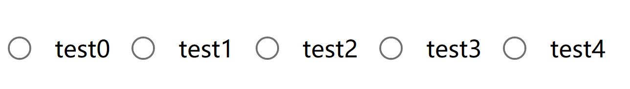
图:横向排列的单选ListBox,左侧为RadioButton,右侧为文本


核心解析:下一代搜索技术的演进与落地策略)


)

)

讲解))

