锋哥原创的Matplotlib3 Python数据可视化视频教程:
2026版 Matplotlib3 Python 数据可视化 视频教程(无废话版) 玩命更新中~_哔哩哔哩_bilibili
课程介绍
本课程讲解利用python进行数据可视化 科研绘图-Matplotlib,学习Matplotlib图形参数基本设置,绘图参数及主要函数,以及Matplotlib基础绘图,和Matplotlib高级绘图。
标注 (Annotations)
标注是数据可视化中用于突出显示特定数据点或区域的重要工具。
annotate() 是 Matplotlib 中用于添加文本注解的核心方法,特别适合在图表中标注特定数据点。以下是全面解析:
plt.annotate(text,                   # 注解文本内容xy,                     # 被注解点的坐标 (x, y)xytext=None,            # 文本位置的坐标 (x, y)arrowprops=None,        # 箭头属性字典**kwargs                # 文本属性 (颜色/字体/对齐等)
)
核心参数详解
| 参数 | 说明 | 示例 |
|---|---|---|
| text | 注解文本内容 | "Peak Value" |
| xy | 被注解点的坐标 | (3, 9) |
| xytext | 文本位置坐标 | (4, 10) |
| arrowprops | 箭头属性字典 | dict(arrowstyle="->") |
| xycoords | 坐标系统(默认为'data') | 'axes fraction' |
| textcoords | 文本坐标系统 | 'offset points' |
| fontsize | 字体大小 | 12 或 'large' |
| color | 文本颜色 | "red" |
| bbox | 文本背景框 | dict(boxstyle="round", fc="w") |
| rotation | 文本旋转角度 | 45 (度) |
| ha/va | 水平/垂直对齐 | 'center', 'top' |
箭头属性详解 (arrowprops)
通过字典自定义箭头样式:
arrowprops = {'arrowstyle': '->',          # 箭头样式'connectionstyle': 'arc3',   # 连接线样式'color': 'blue',             # 箭头颜色'linewidth': 2,              # 线宽'linestyle': '--',           # 线型'alpha': 0.7,                # 透明度'relpos': (0.5, 0.5)         # 箭头起点相对位置
}
常用箭头样式:
| 样式字符串 | 说明 | 图示 |
|---|---|---|
'-' | 无箭头直线 | —— |
'->' | 单箭头 | → |
'<-' | 反向单箭头 | ← |
'<->' | 双箭头 | ↔ |
'fancy' | 精致箭头 | ➤ |
'wedge' | 楔形箭头 | ▷ |
坐标系统详解
通过 xycoords 和 textcoords 指定坐标基准:
| 坐标系统 | 说明 | 应用场景 |
|---|---|---|
| 'data' | 默认数据坐标 | 标注数据点 |
| 'axes fraction' | 子图比例 (0,0)左下 (1,1)右上 | 固定位置标注 |
| 'figure fraction' | 全图比例 | 跨子图标注 |
| 'offset points' | 相对某点的像素偏移 | 微调位置 |
| 'polar' | 极坐标 (theta, r) | 极坐标图 |
# 使用不同坐标系统的示例
plt.annotate('Fixed Position',xy=(0.5, 0.5), xycoords='axes fraction', # 子图中点ha='center'
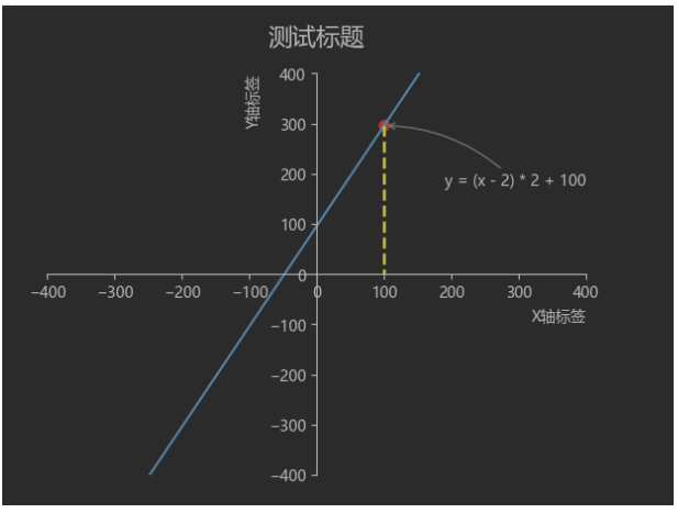
)完整实例:
import matplotlib
import numpy as np
from matplotlib import pyplot as plt
# 设置matplotlib使用黑体显示中文
matplotlib.rcParams['font.family'] = 'Microsoft YaHei'
# 生成数据
x = np.arange(-400, 400, 5)
y = (x - 2) * 2 + 100
# 绘图
plt.plot(x, y)
# 设置x轴的刻度
plt.xlim(-400, 400)
# 设置y轴的刻度
plt.ylim(-400, 400)
# 获取当前的axes
ax = plt.gca()
ax.set_title('测试标题', fontsize=16, pad='20')
ax.set_xlabel('X轴标签', fontsize=10, loc='right')
ax.set_ylabel('Y轴标签', fontsize=10, loc='top')
ax.spines['right'].set_color('none')
ax.spines['top'].set_color('none')
ax.spines['bottom'].set_position(('data', 0))
ax.spines['left'].set_position(('data', 0))
x1 = 100
y1 = (x1 - 2) * 2 + 100
# 绘制点
plt.scatter(x1, y1, s=45, color='r')
# 绘制虚线
plt.plot([x1, x1], [y1, 0], 'y--', lw=2)
# 加标注
plt.annotate('y = (x - 2) * 2 + 100', xy=(x1, y1), textcoords='offset points', xytext=(+40, -40),arrowprops=dict(arrowstyle="->",connectionstyle="arc3,rad=0.2", # 弧度连接color="gray"))
# 显示图片
plt.show()运行效果:


: do color print in console)


【Springboot使用阿里云OSS】)

——结构体、联合体、枚举)
)


