前言
本文基于Api13
列表吸顶功能,在实际的开发中有着很大的作用,比如可以让列表层级之间更加分明,减少一定程度上的视觉混乱,由于吸顶的标题会随着滚动固定在顶部,可以让用户无需反复滑动回顶部确认分组位置,方便实时定位当前分组,可以说还是非常方便的;常见的场景有联系人的页面,电商软件的购物车等。
鸿蒙当中实现一个列表吸顶,很是简单,官方为我们提供了ListItemGroup组件,使用它,便可以轻松搞定,我们可以先来看一个简单的案例:
interface CityData {name: string;address: string[];
}@Entry
@Component
struct Index {private cityData: CityData[] = [{name: '北京市',address: ['朝阳区', '东城区', '西城区']}, {name: '河北省',address: ['石家庄', '保定市', '唐山市']}, {name: '河南省',address: ['郑州市', '商丘市', '洛阳市', '开封市']}, {name: '山西省',address: ['太原市', '晋城市', '大同市', '长治市']}]@BuilderitemHead(text: string) {Text(text).fontSize(18).height(40).fontColor(Color.White).backgroundColor(Color.Orange).width('100%')}//组件使用build() {Column() {List() {ForEach(this.cityData, (item: CityData) => {ListItemGroup({ header: this.itemHead(item.name) }) {ForEach(item.address, (address: string) => {ListItem() {Text(address).width("100%").height(80).fontSize(16).textAlign(TextAlign.Center)}}, (item: string) => item)}.divider({ strokeWidth: 1, color: Color.Gray })})}.width("100%").sticky(StickyStyle.Header).scrollBar(BarState.Off)}.width("100%").height("100%")}
}
运行之后,效果如下:
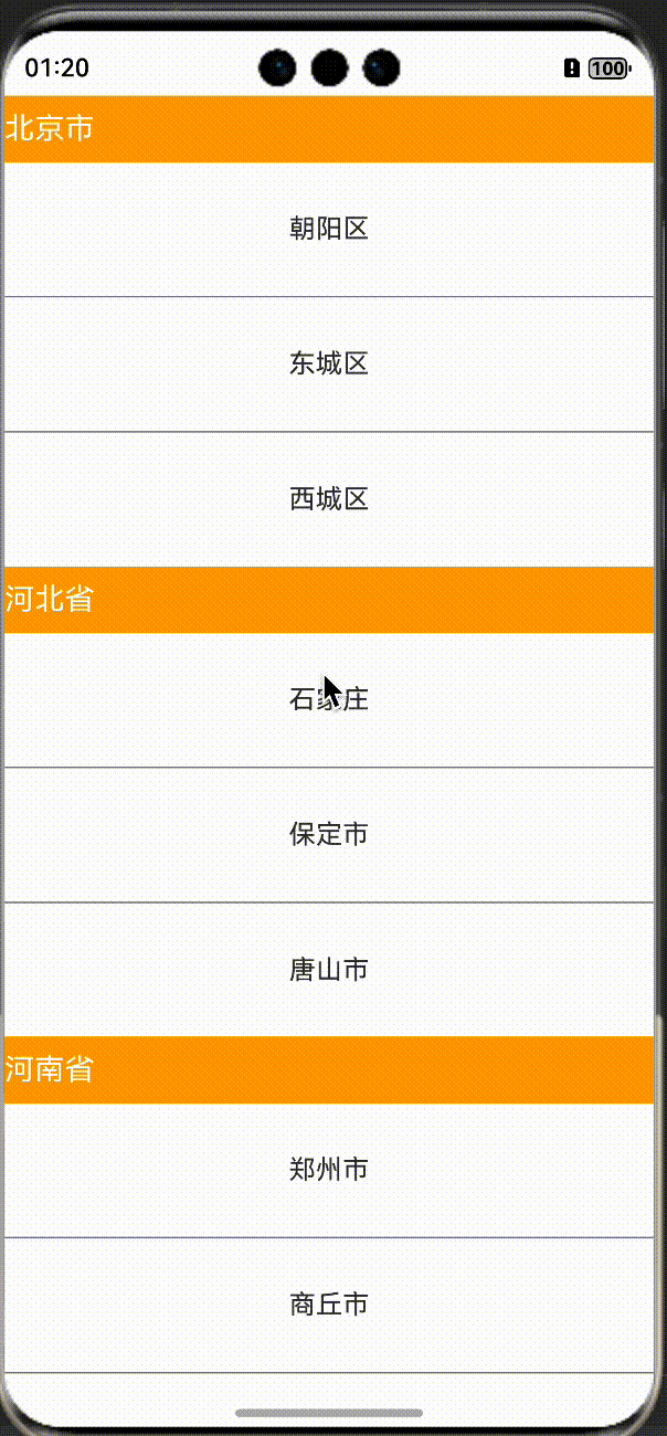
从以上的案例中我们可以看到,ListItemGroup组件是必须要结合List组件一起使用的,这一点一定要知晓,下面,针对ListItemGroup组件,我们就一起来探究一下吧。
ListItemGroup使用方式
通过源码,我们可以看到,ListItemGroup组件接收了一个ListItemGroupOptions参数。
/*** Called when interface is called.** @param { ListItemGroupOptions } options* @returns { ListItemGroupAttribute }* @syscap SystemCapability.ArkUI.ArkUI.Full* @crossplatform* @atomicservice* @since 11*/(options?: ListItemGroupOptions): ListItemGroupAttribute;ListItemGroupOptions可选择的属性如下,一般最常用的就是header属性,也就是吸顶时的标题栏组件。
| 名称 | 类型 | 必填 | 说明 |
| header | CustomBuilder | 否 | ListItemGroup头部组件。 |
| headerComponent13+ | ComponentContent | 否 | 使用ComponentContent类型参数设置ListItemGroup头部组件。 |
| footer | CustomBuilder | 否 | 设置ListItemGroup尾部组件。 |
| footerComponent13+ | ComponentContent | 否 | 使用ComponentContent类型参数设置ListItemGroup尾部组件。 |
| space | number | string | 否 | 列表项间距。只作用于ListItem与ListItem之间,不作用于header与ListItem、footer与ListItem之间。 默认值:0 单位:vp |
| style10+ | ListItemGroupStyle | 否 | 设置List组件卡片样式。 默认值:ListItemGroupStyle.NONE |
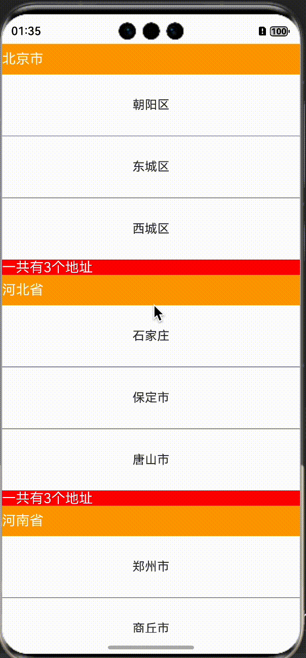
我们可以把前言中的案例改造一下,加一个footer属性:
ListItemGroup({header: this.itemHead(item.name),footer: this.itemFooter(item.address.length.toString())})尾部组件视图:
@BuilderitemFooter(text: string) {Text("一共有" + text + "个地址").fontSize(18).height(20).fontColor(Color.White).backgroundColor(Color.Red).width('100%')}运行之后,效果如下:
headerComponent和footerComponent参数,和header与footer功能一样,都是用于头或者尾组件,但是,他们的优先级高于后者,也就是如果你同时设置了他们,在实际的效果中会以前者为准。
headerComponent和footerComponent参数接收了一个ComponentContent参数,使用它,我们可以共用一个公共的视图组件,因为它可以接受一个wrapBuilder参数。
比如上述的代码,我们使用headerComponent代替header,运行之后可以发现,其实效果是一样的。
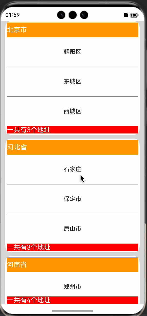
headerComponent: new ComponentContent(this.getUIContext(), wrapBuilder(buildHeader), item.name)除此之外,还有一个style属性,使用它,可以实现一个卡片样式的效果:
style: ListItemGroupStyle.CARD设置后,会展示如下的卡片效果:
refresh库实现
refresh库是我开发的一个列表刷新加载库,上架一年多来,已经有三万多次的下载量,获得了很多开发者的一致好评,如果您也感兴趣,可以访问如下的refresh库地址,里面有详细的使用方式:
https://ohpm.openharmony.cn/#/cn/detail/@abner%2Frefresh
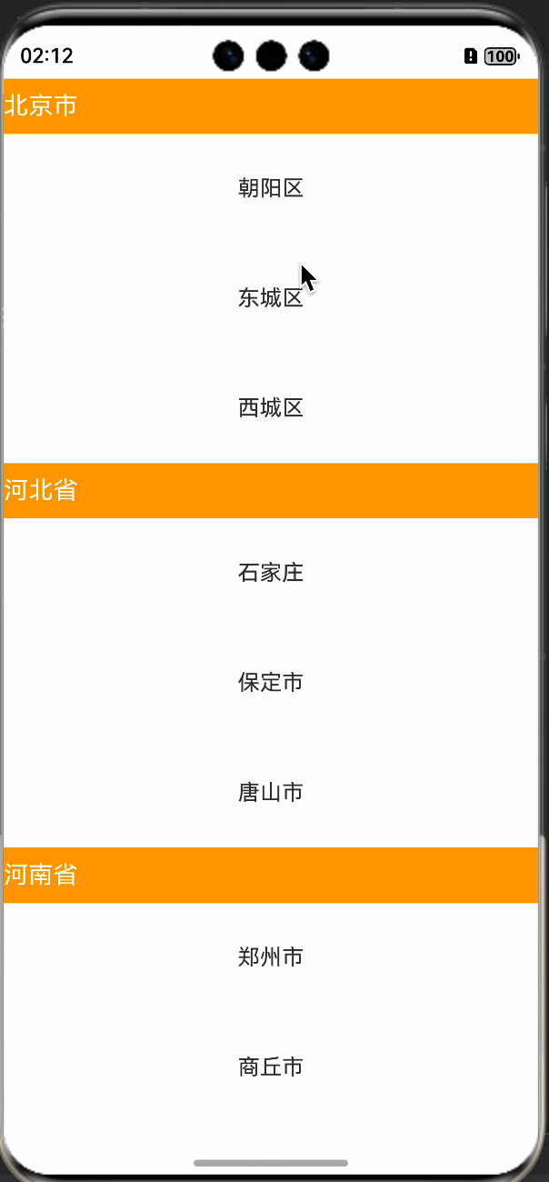
使用刷新库,实现一个列表吸顶也是非常的简单,具体使用如下:
ListView({controller: this.controller, //刷新控制器itemGroupHeader: this.itemHead, //分组头itemGroupData: this.cityData, //分组数据itemLayout: this.itemLayout, //内容视图onRefresh: () => {setTimeout(() => {//模拟耗时this.controller.finishRefresh()}, 2000)},onLoadMore: () => {setTimeout(() => {//模拟耗时this.controller.finishLoadMore()}, 2000)}})效果如下:
相关总结
ListItemGroup组件的使用,可以说是非常的简单,如果仅仅是普通的吸顶,建议直接使用即可,如果您需要带有下拉刷新和上拉加载效果的,可以使用refresh组提供的,在使用原生的时候,有一点需要注意,那就是需要设置List组件的sticky属性,否则吸顶效果是不生效的。
.sticky(StickyStyle.Header|StickyStyle.Footer)StickyStyle属性介绍如下:
| 名称 | 值 | 说明 |
| None | 0 | header不吸顶,footer不吸底。 |
| Header | 1 | header吸顶,footer不吸底。 |
| Footer | 2 | footer吸底,header不吸顶。 |
本文标签:HarmonyOS/ArkUI


的结构)


)


)


