一、简答题
1. (1)为什么要清除浮动?
答:当子元素浮动时会脱离文档流,父元素无法正确计算子元素高度导致高度、边框异常显示。同时会影响后续文档流布局。
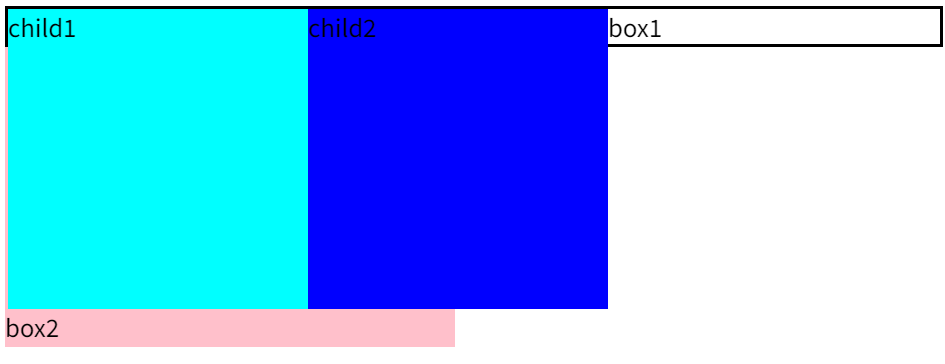
<style>.box1 {border: solid 2px #000;}.child1 {float: left;height: 200px;width: 200px;background-color: aqua;}.child2 {float: left;height: 200px;width: 200px;background-color: blue;}.box2 {height: 200px;width: 300px;background-color: pink;}</style><body><div class="box1">box1<div class="child1">child1</div><div class="child2">child2</div></div><div class="box2">box2</div>
</body>
1.(2)清除浮动的方法有哪些?
-
额外标签法,给父盒子添加标签:<div class="clear"></div>>,标签定义为
.clear{
clear:both;
}
该标签必须是块级元素。清除后,父盒子可以根据子盒子的高度调整高度。
-
父级添加-overflow
overflow:hidden/auto/scroll;
注意:无法清除溢出部分
-
after伪元素-额外标签法升级版
.clearfix:after{content:"";display: block;height:0;clear:both;visibility:hidden;}
.clearfix{ /* IE6、7 专有 */   *zoom:1;}
再给父元素增加类型clearfix即可
-
双伪元素
.clearfix:before,.clearfix:after {content:"";display:table;}
.clearfix:after {clear:both;}
.clearfix {*zoom:1;}
再给父元素增加类型clearfix即可
2.怎么实现左边宽度固定右边宽度自适应的布局?
- 传统布局:左固定高度+右margin(不推荐)
- flex布局:给父盒子添加display:flex;属性,为其左边的子元素设置好固定宽度,为右边子元素设置flex:1属性
-
grid布局(更现代)
.container {display: grid;grid-template-columns: 200px 1fr; /* 第一列固定,第二列自适应 */
}
.left { background: #f00; }
.right { background: #0f0; }
3. 讲讲flex:1;
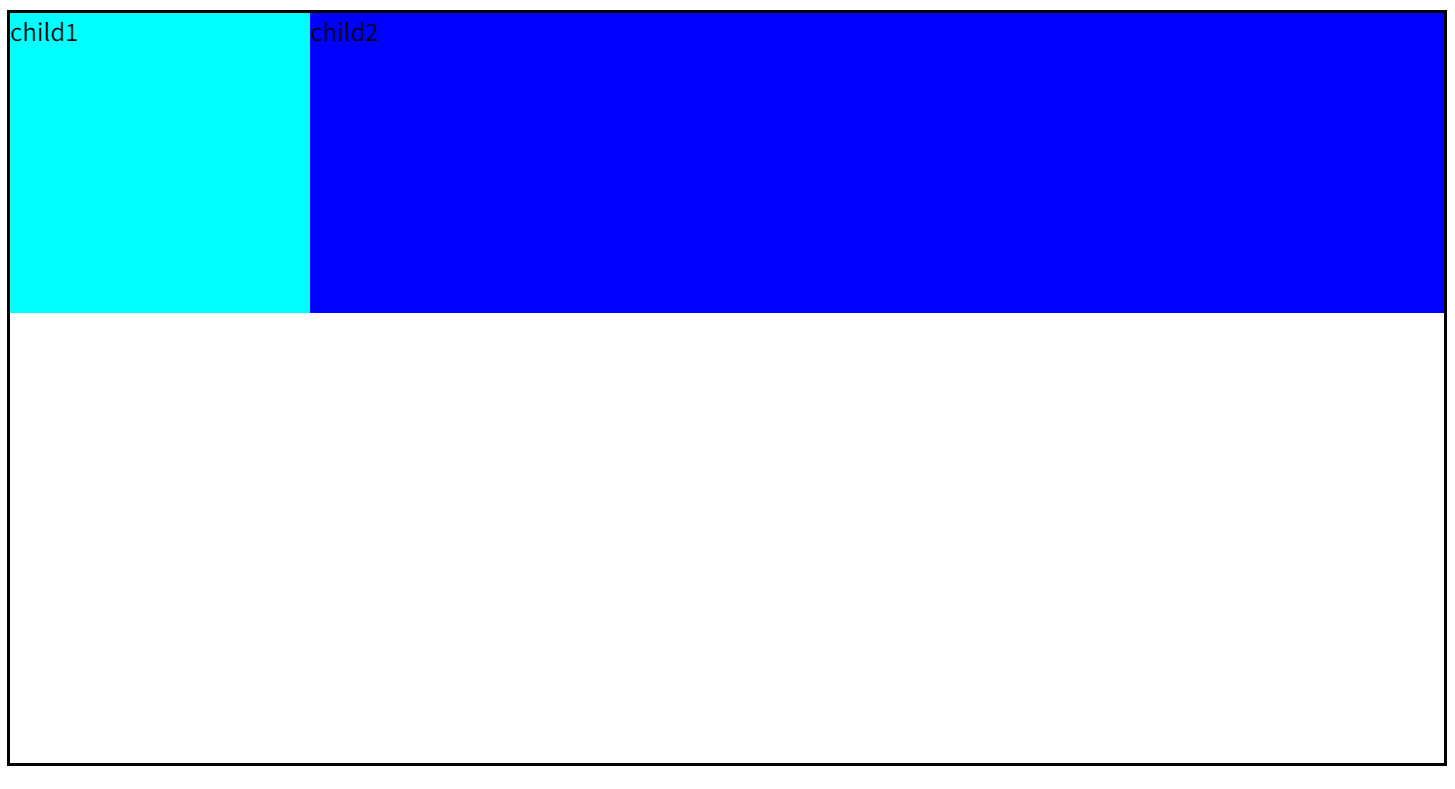
答:flex:1为该项目在含有display:flex属性的父盒子内,在主轴上在剩余空间(父盒子宽/高-主轴固定宽/高)所占有的份数为1。
<style>.box1 {display: flex;height: 500px;border: solid 2px #000;}.child1 {height: 200px;width: 200px;ackground-color: aqua;}.child2 {height: 200px;flex: 1;background-color: blue;}
</style><body><div class="box1"><div class="child1">child1</div><div class="child2">child2</div></div>
</body>
child1固定宽度,child2占主轴剩余空间1份:
        .child3{flex:2;height: 200px;background-color: pink;}
<body><div class="box1"><div class="child1">child1</div><div class="child2">child2</div><div class="child3">child3</div></div>
</body>
child2占据主轴剩余空间1份,child3占据两份。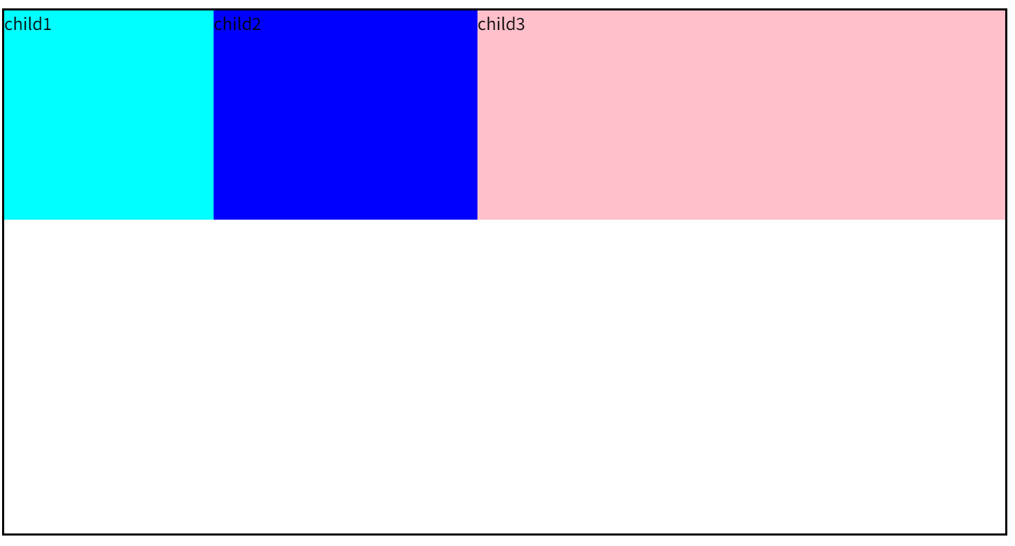
4.怎么实现移动端适配不同设备?
方案1:媒体查询+rem布局
1. 设置基准(以750px为例)
假设设计稿宽度为 750px,约定 1rem = 100px(LESS):
/* 默认基准(适用于320px~750px屏幕) */
html {font-size: calc(100vw / 7.5); /* 750px设计稿:100px = 1rem */
}
2. 媒体查询
/* 超小屏幕(小于320px) */
@media screen and (max-width: 320px) {html {font-size: 42.6667px; /* 320/7.5 */}
}/* 大屏幕(大于750px)限制最大缩放 */
@media screen and (min-width: 750px) {html {font-size: 100px; /* 固定最大值 */}
}
3. 尺寸设置使用rem
.header {height: 0.88rem;  /* 设计稿88px → 0.88rem */font-size: 0.32rem; /* 设计稿32px → 0.32rem */margin: 0 0.2rem;  /* 设计稿20px → 0.2rem */
}
方案2:Viewport单位(vw/vh)(使用LESS)
/* 设计稿750px下:1vw = 7.5px */
.box {width: 13.333vw; /* 100px / 7.5 */font-size: calc(16 / 7.5 * 1vw); /* 16px */
}
方案3:媒体查询(Media Queries)
@media screen and (max-width: 320px) {body { font-size: 12px; }
}
@media screen and (min-width: 414px) {body { font-size: 18px; }
}
二、实践题
1.题目: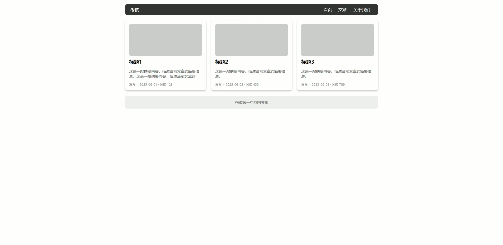
代码:
<!DOCTYPE html>
<html lang="en"><head><meta charset="UTF-8"><meta name="viewport" content="width=device-width, initial-scale=1.0"><title>Document</title><style>.w {margin: 0 auto;}ul {padding: 0;}li {list-style: none;}.box {width: 960px;height: 400px;}header {color: #fff;font-size: 15px;width: 100%;height: 40px;background-color: #313531;border-radius: 6px;line-height: 40px;}.test {float: left;margin-left: 20px;}.imfor ul li {float: right;margin-right: 25px;}section {display: flex;justify-content: space-between;}.content {padding: 15px;background-color: #fff;height: 252px;width: 275px;border-radius: 10px;margin: 20px 0;box-shadow: 1px 2px 5px #9d9d9d;}.pic {box-sizing: border-box;height: 120px;width: 270px;background-color: #c9cdc9;border-radius: 6px;}.word {font-size: 13px;width: 270px;display: -webkit-box;-webkit-box-orient: vertical;-webkit-line-clamp: 2;line-clamp: 2;overflow: hidden;}.date {margin-top: 10px;font-size: 10px;color: #9d9d9d;}footer {line-height: 49px;text-align: center;width: 100%;height: 49px;background-color: #ecf0ec;border-radius: 12px;color: #898989;font-size: 13px;}</style>
</head><body><div class="box w"><header><div class="test">考核</div><div class="imfor"><ul><li>关于我们</li><li>文章</li><li>首页</li></ul></div></header><section><div class="content"><div class="pic"></div><h1>标题1</h1><div class="word">这是一段摘要内容,描述当前文章的简要信息。这是一段摘要内容,描述当前文章的简要信息。这是一段摘要内容,描述当前文章的简要信息。</div><div class="date">发布于2026-06-01·阅读123</div></div><div class="content"><div class="pic"></div><h1>标题1</h1><div class="word">这是一段摘要内容,描述当前文章的简要信息。这是一段摘要内容,描述当前文章的简要信息。这是一段摘要内容,描述当前文章的简要信息。</div><div class="date">发布于2026-06-01·阅读123</div></div><div class="content"><div class="pic"></div><h1>标题1</h1><div class="word">这是一段摘要内容,描述当前文章的简要信息。这是一段摘要内容,描述当前文章的简要信息。这是一段摘要内容,描述当前文章的简要信息。</div><div class="date">发布于2026-06-01·阅读123</div></div></section><footer>web第一次方向考核</footer></div>
</body></html>
效果:
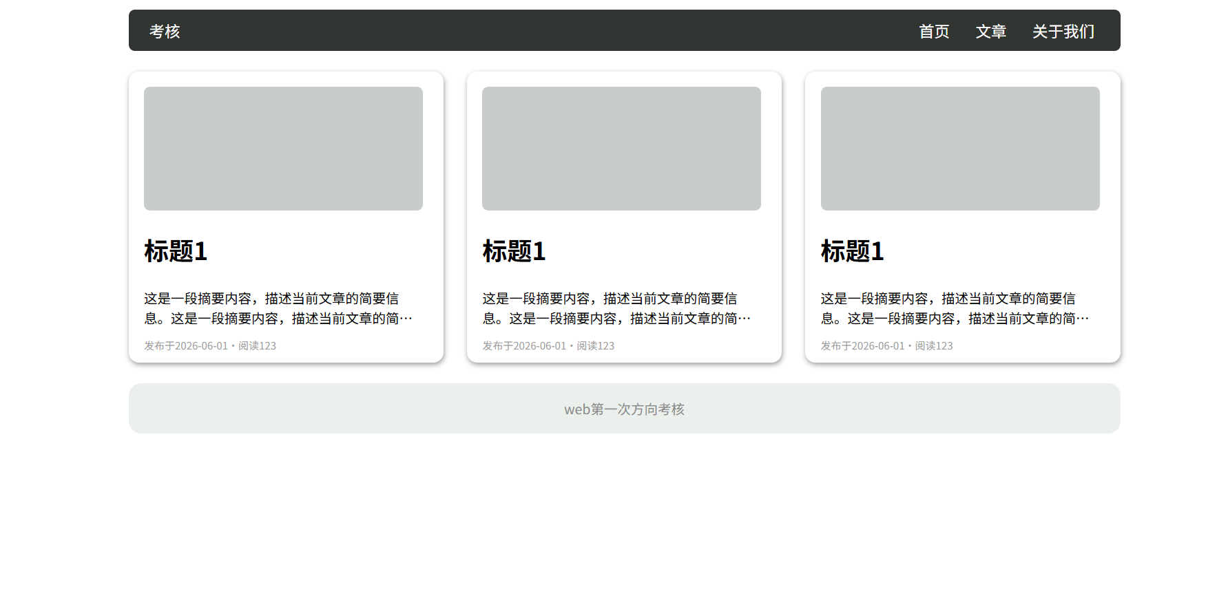
注意点:
- 头部盒子使用左右浮动
- 中间盒子使用flex布局更易使内容居中对齐
- 文本溢出文字省略号显示:
- 单行
.word{/*先强制一行内显示文本*/white-space: nowrap;/*超出部分隐藏*/overflow:hidden;/*省略号代替超出部分*/text-overflow:ellipsis;} - 多行
.word {text-overflow:ellipsis;overflow: hidden;/*弹性伸缩盒子模型显示*/display: -webkit-box;/*设置或检索伸缩盒子的子元素的排列方式*/-webkit-box-orient: vertical;/*限制在一个块元素的文本行数*/-webkit-line-clamp: 2;line-clamp: 2;}
- 单行
2.题目:
代码:
<!DOCTYPE html>
<html lang="en"><head><meta charset="UTF-8"><meta name="viewport" content="width=device-width, initial-scale=1.0"><title>Document</title><style>.box {top: 0;height: 100px;width: 70px;background-color: aquamarine;border-radius: 6px;text-align: center;font-size: 60px;overflow: hidden;}.content{position: relative;top: 0;transition: all 1s;}.box:hover .content{position: relative;top: -690px;}</style>
</head><body><div class="box"><div class="content"><div>1</div><div>2</div><div>3</div><div>4</div><div>5</div><div>6</div><div>7</div><div>8</div><div>9</div></div></div>
</body></html>
效果:
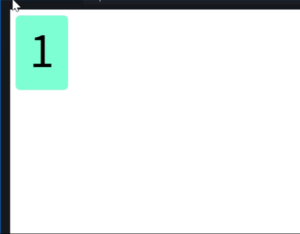
思路:
大盒子套小盒子,小盒子里装数字,并为小盒子添加过渡属性。当光标移至大盒子处时,小盒子向上走。
3.题目:
代码:
<!DOCTYPE html>
<html lang="en"><head><meta charset="UTF-8"><meta name="viewport" content="width=device-width, initial-scale=1.0"><title>Document</title><style>@keyframes change {0% {transform: scaleY(0.08);}50% {transform: scaleY(1);}100% {transform: scaleY(0.08);}}.box {display: flex;justify-content: center;align-items: center;margin: 100px auto;height: 200px;width: 100px;background-color: #fff;}div {margin-left: 2px;height: 100px;width: 5px;background-color: blue;border-radius: 3px;transition: all 1s;animation: change 2s linear infinite;}div:nth-child(n+2) {animation-delay: 0.2s;}div:nth-child(n+3) {animation-delay: 0.4s;}div:nth-child(n+4) {animation-delay: 0.6s;}div:nth-child(n+5) {animation-delay: 0.8s;}div:nth-child(n+6) {animation-delay: 1s;}div:nth-child(n+7) {animation-delay: 1.2s;}div:nth-child(n+8) {animation-delay: 1.4s;}div:nth-child(n+9) {animation-delay: 1.6s;}div:nth-child(n+10) {animation-delay: 1.8s;}div:nth-child(n+11) {animation-delay: 2s;}div:nth-child(n+12) {animation-delay: 2.2s;}</style>
</head><body><header class="box"><div></div><div></div><div></div><div></div><div></div><div></div><div></div><div></div><div></div><div></div><div></div><div></div><div></div></header>
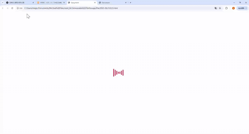
</body></html>效果:
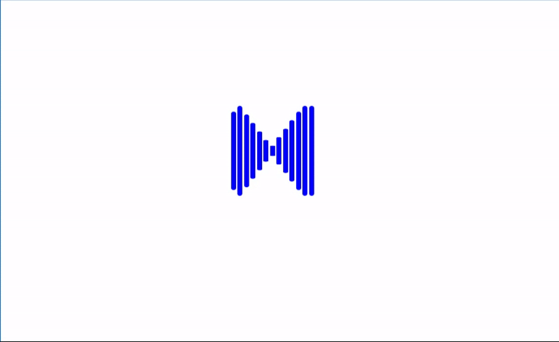
思路:
给所有子盒子添加缩放动画,并按照顺序添加animation-delay属性,若要图像向右走,则delay随盒子顺序递增,若要图像向左走,delay随盒子顺序递减。
4.题目:
代码:
<!DOCTYPE html>
<html lang="en"><head><meta charset="UTF-8"><meta name="viewport" content="width=device-width, initial-scale=1.0"><title>Document</title><style>.w {margin: 0 auto;}div:nth-child(1) {transition-delay: 0s;}div:nth-child(2) {transition-delay: 0.2s;}div:nth-child(3) {transition-delay: 0.4s;}div:nth-child(4) {transition-delay: 0.6s;}div:nth-child(5) {transition-delay: 0.8s;}div:nth-child(6) {transition-delay: 1s;}div:nth-child(7) {transition-delay: 1.2s;}div:nth-child(8) {transition-delay: 1.4s;}div:nth-child(9) {transition-delay: 1.6s;}section {display: flex;justify-content: center;align-items: center;height: 200px;width: 200px;background-color: aqua;}div {margin-left: 5px;height: 5px;width: 5px;background-color: blue;border-radius: 3px;transition: all 0.5s;}section:hover div:nth-child(1) {height: 15px;}section:hover div:nth-child(2) {height: 30px;}section:hover div:nth-child(3) {height: 45px;}section:hover div:nth-child(4) {height: 45px;margin-top: 10px;}section:hover div:nth-child(5) {height: 50px;margin-top: 25px;}section:hover div:nth-child(6) {height: 45px;margin-top: 10px;}section:hover div:nth-child(7) {height: 45px;}section:hover div:nth-child(8) {height: 30px;}section:hover div:nth-child(9) {height: 15px;}</style>
</head><body><section class="w"><div></div><div></div><div></div><div></div><div></div><div></div><div></div><div></div><div></div></section>
</body></html>
效果: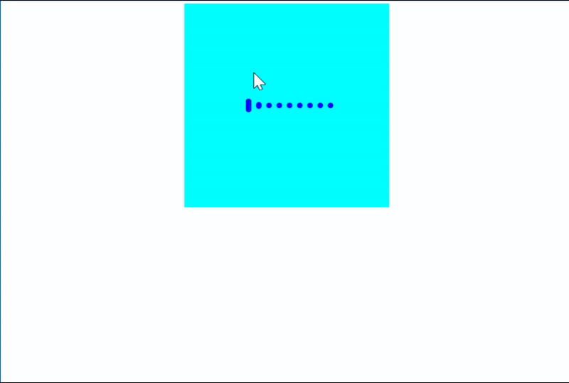
思路:
要求元素做到hover响应,并在光标移开时相应元素也有相应的延迟过渡,如果响应设置为动画并添加到hover伪类中,光标移开动画属性即撤销,要做到撤销后仍保留动画还原的推迟,这是html和css范围内的基础动画无法实现的,考虑使用过渡。
我们知道光标移开后hover属性撤销,想要实现撤销后仍然有延迟过渡,我们需要该元素本身就有延迟过渡的属性,所以先为各元素设置其自身的延迟过渡:
div:nth-child(1) {transition-delay: 0s;}div:nth-child(2) {transition-delay: 0.2s;}div:nth-child(3) {transition-delay: 0.4s;}div:nth-child(4) {transition-delay: 0.6s;}div:nth-child(5) {transition-delay: 0.8s;}div:nth-child(6) {transition-delay: 1s;}div:nth-child(7) {transition-delay: 1.2s;}div:nth-child(8) {transition-delay: 1.4s;}div:nth-child(9) {transition-delay: 1.6s;}
然后设置hover的变化:
section:hover div:nth-child(1) {height: 15px;}section:hover div:nth-child(2) {height: 30px;}section:hover div:nth-child(3) {height: 45px;}section:hover div:nth-child(4) {height: 45px;margin-top: 10px;}section:hover div:nth-child(5) {height: 50px;margin-top: 25px;}section:hover div:nth-child(6) {height: 45px;margin-top: 10px;}section:hover div:nth-child(7) {height: 45px;}section:hover div:nth-child(8) {height: 30px;}section:hover div:nth-child(9) {height: 15px;}效果实现,针对想要的特殊情况再进行特别修改即可。
read函数)


:可解释性)


RISC-V)


