在这之前,先来介绍一下 ProseMirror:
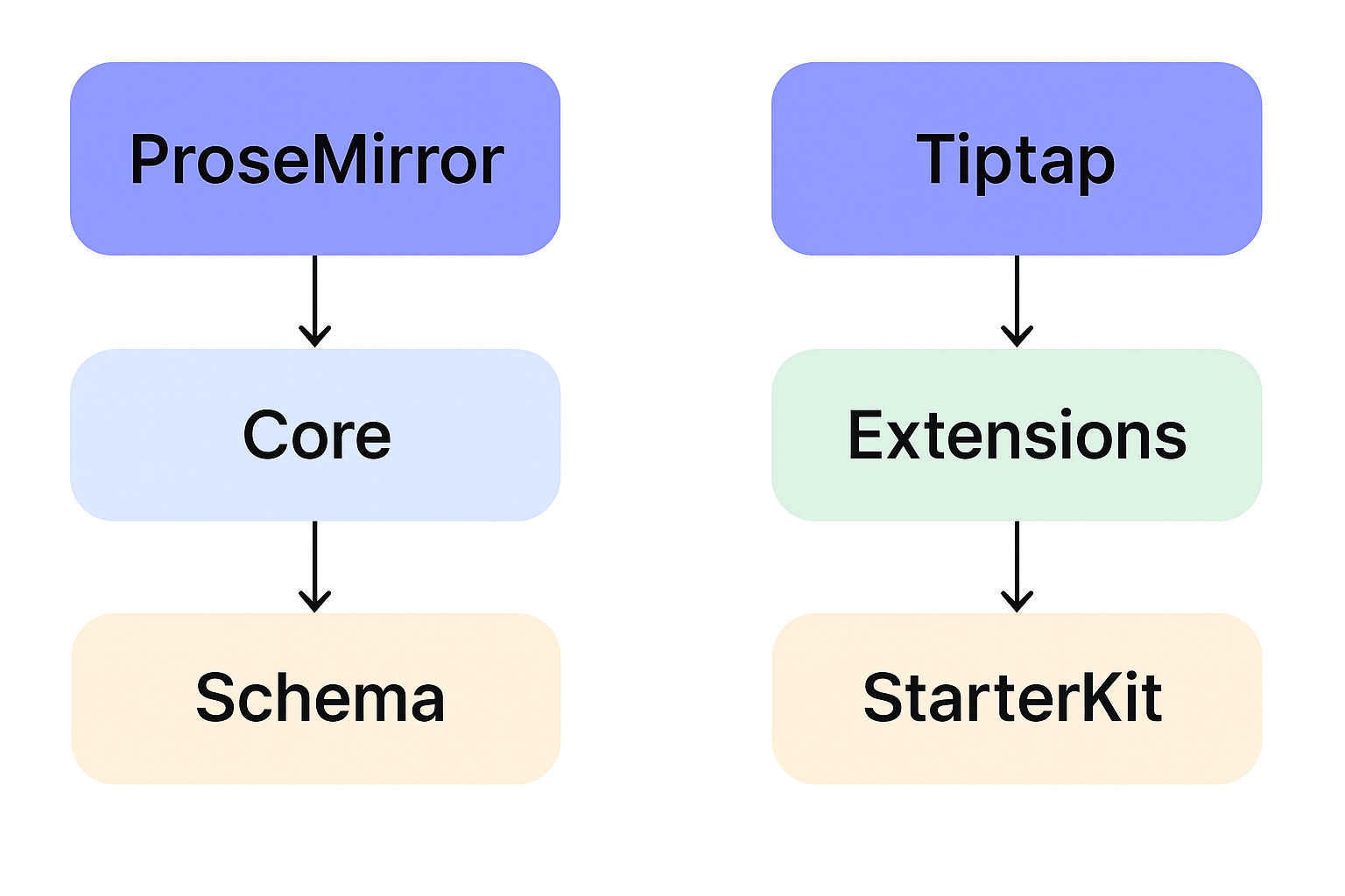
1. ProseMirror 是底层内核
-
定位:一个强大的 富文本编辑框架/引擎,不是一个成品编辑器。
-
作者:Marijn Haverbeke(CodeMirror 作者)。
-
核心思想:
- 用 schema(模式) 定义文档结构(节点、marks、attributes)。
- 每个操作(加粗、插入段落)都是 transaction(事务)。
- 提供 collab(协作)、history、markdown 解析、插件系统 等能力。
-
问题:API 很底层、复杂(写一个“加粗按钮”就需要懂 state/transaction/command)。
2. Tiptap 是 ProseMirror 的高级封装
-
定位:一个 基于 ProseMirror 的现代编辑器框架。
-
特点:
- 提供了更友好的 API(例如
editor.chain().focus().toggleBold().run(),不用直接操作 transaction)。 - 内置常用扩展(StarterKit:paragraph、heading、bold、italic、list、code 等)。
- 框架无关(React、Vue、Svelte、纯 JS 都能用)。
- 社区活跃,扩展丰富(Mention、SlashCommand、Table、Collaboration 等)。
- 专门为现代 Web 应用优化(支持移动端、协同编辑、富 UI 集成)。
- 提供了更友好的 API(例如
3. 核心区别
| 对比点 | ProseMirror | Tiptap |
|---|---|---|
| 定位 | 底层引擎 / 框架 | 高级封装 / 开发者友好的框架 |
| 难度 | 高(API 底层,文档晦涩) | 中等(链式调用,扩展丰富) |
| 功能 | 一切都要自己实现 | 内置 StarterKit,常用功能即插即用 |
| UI | 没有(自己写) | 没有默认 UI,但社区有现成扩展 |
| 灵活性 | 无限灵活 | 灵活 + 更高生产力 |
| 适合人群 | 想深度定制、写自己编辑器内核的人 | 想快速落地 Notion/Google Docs 类应用的人 |
4. 关系总结
- ProseMirror = 编辑器的内核(底层引擎)。
- Tiptap = 基于 ProseMirror 的开发框架(更好用的外壳)。
- 你用 Tiptap,其实是在用 ProseMirror,只不过被封装了一层,更易上手。
- 如果你遇到 Tiptap 没提供的功能,最终可能需要写 ProseMirror 插件/扩展。
- ProseMirror vs Tiptap 的架构图:
下面,回归正题:
一、本文将对比 Tiptap Editor 和 TinyMCE,从技术架构、功能、扩展性、适用场景等方面做出分析。
1. 技术架构
-
Tiptap Editor
- 基于 ProseMirror,是一个现代化的富文本编辑框架。
- 完全用 JavaScript/TypeScript 编写,UI 无关(React、Vue、Svelte 都能集成)。
- 更偏向“编辑器框架”,需要开发者配置和扩展。
-
TinyMCE
- 历史悠久的传统富文本编辑器(WYSIWYG),早期就用于网页中的文字编辑。
- 内置 UI(工具栏、菜单)和功能较多,开箱即用。
- 偏向于“现成的产品”,即插即用。
2. 功能特性
-
Tiptap
- 灵活度高,可以完全自定义编辑体验(例如 Notion、Slack、Linear 都是基于 ProseMirror/Tiptap)。
- 支持协同编辑(结合 yjs/y-websocket)。
- 插件体系强大(markdown、mention、slash command、自定义节点)。
- 原生支持移动端、现代前端框架。
- UI/菜单需要自己实现或用社区扩展。
-
TinyMCE
- 开箱即用的传统功能:字体、颜色、表格、图片上传、对齐、列表等等。
- 插件体系完善,但更多是 WYSIWYG 的扩展(如 word count、spellcheck)。
- 有商业版(带更多企业功能,如 MS Word/Google Docs 级别的协作和导出)。
- 移动端体验不如 Tiptap,但兼容性很好。
3. 学习曲线
- Tiptap:需要较强的前端开发能力,理解 ProseMirror schema、node/mark 才能发挥最大价值。
- TinyMCE:学习成本低,只要引入脚本即可用,配置主要是工具栏和插件。
4. 可扩展性 & 自定义
-
Tiptap
- 高度可定制,可以实现类似 Notion、Coda、Obsidian 那种 block-based 编辑器。
- 自定义节点(自定义组件、Vue/React 元素嵌入)非常灵活。
- 对现代 web app(SaaS、在线文档)很适合。
-
TinyMCE
- 自定义能力有限,虽然可以写插件,但核心思想还是“富文本编辑器”。
- 适合标准化的富文本场景(CMS、论坛、评论系统)。
5. 使用场景
-
选择 Tiptap
- 你在做一个 现代 SaaS/协作工具(比如 Notion、文档协作、知识库)。
- 需要 协作编辑、自定义 block/组件。
- 前端团队实力较强,可以投入时间定制。
-
选择 TinyMCE
- 你在做 CMS、表单、企业后台,只需要 标准富文本(发文章、加粗、插入表格图片)。
- 团队希望 快速上线,不想花时间定制编辑器。
- 用户群体对“Word 类似体验”有需求。
6. 对比总结
| 特性 | Tiptap Editor (ProseMirror) | TinyMCE |
|---|---|---|
| 定位 | 编辑器框架 (现代、灵活) | 成品富文本编辑器 (传统、开箱即用) |
| UI/工具栏 | 需要自己做 / 社区扩展 | 内置完善工具栏 |
| 功能扩展 | 无限灵活,可嵌入 React/Vue 组件 | 主要是 WYSIWYG 扩展 |
| 协同编辑 | 支持 (yjs 集成) | 商业版支持 |
| 移动端体验 | 优秀 | 一般 |
| 学习成本 | 高(要理解 ProseMirror) | 低(配置工具栏即可) |
| 最佳适用场景 | Notion/知识库/协作编辑 | CMS/后台文章/传统富文本 |
二、 下面将提供 Tiptap (Vue 3) 和 TinyMCE (纯 HTML/JS) 的最小可运行示例
1. Tiptap (Vue 3 示例)
<template><div><EditorContent :editor="editor" class="border p-3 min-h-[200px]" /></div>
</template><script setup>
import { ref, onBeforeUnmount } from "vue"
import { EditorContent, useEditor } from "@tiptap/vue-3"
import StarterKit from "@tiptap/starter-kit"const editor = useEditor({extensions: [StarterKit],content: "<p>Hello <b>Tiptap</b> 🚀</p>",
})onBeforeUnmount(() => {editor?.destroy()
})
</script><style>
.ProseMirror {min-height: 200px;outline: none;
}
</style>
👉 特点:
- 这是最小示例,只带 StarterKit(加粗、斜体、标题、列表、代码等基础功能)。
- 你可以往里加插件,比如 mention、slash command、表格、Markdown。
- 没有默认工具栏,要自己写按钮控制(高度可定制)。
2. TinyMCE (纯 HTML/JS 示例)
<!DOCTYPE html>
<html>
<head><script src="https://cdn.tiny.cloud/1/no-api-key/tinymce/6/tinymce.min.js"></script>
</head>
<body><textarea id="editor">Hello <b>TinyMCE</b> ✨</textarea><script>tinymce.init({selector: '#editor',height: 300,plugins: 'lists link image table code',toolbar: 'undo redo | bold italic underline | bullist numlist | link image table | code',});</script>
</body>
</html>
👉 特点:
- 一引入就能用,带完整工具栏。
- 插件和配置非常像传统富文本(Word)。
- 如果要集成到 Vue/React,也有官方包,但核心就是
tinymce.init。
📌 总结:
- Tiptap → 需要开发者写 UI,但能做出 Notion/Slack/协作文档 的感觉。
- TinyMCE → 一步到位,像 Word 编辑器,但定制自由度没那么高。
三、下面示例将完善一下工具栏
Tiptap (Vue 3 + 工具栏 示例)
<template><div class="editor"><!-- 工具栏 --><div class="toolbar"><button @click="toggleBold" :class="{ active: editor.isActive('bold') }">B</button><button @click="toggleItalic" :class="{ active: editor.isActive('italic') }">I</button><button @click="setHeading(1)" :class="{ active: editor.isActive('heading', { level: 1 }) }">H1</button><button @click="setHeading(2)" :class="{ active: editor.isActive('heading', { level: 2 }) }">H2</button><button @click="toggleBulletList" :class="{ active: editor.isActive('bulletList') }">• List</button><button @click="toggleOrderedList" :class="{ active: editor.isActive('orderedList') }">1. List</button><button @click="toggleCodeBlock" :class="{ active: editor.isActive('codeBlock') }">Code</button></div><!-- 编辑区 --><EditorContent :editor="editor" class="editor-content" /></div>
</template><script setup>
import { onBeforeUnmount } from "vue"
import { EditorContent, useEditor } from "@tiptap/vue-3"
import StarterKit from "@tiptap/starter-kit"const editor = useEditor({extensions: [StarterKit],content: "<p>Hello <b>Tiptap</b> with Toolbar 🚀</p>",
})onBeforeUnmount(() => {editor?.destroy()
})// 工具栏方法
const toggleBold = () => editor.chain().focus().toggleBold().run()
const toggleItalic = () => editor.chain().focus().toggleItalic().run()
const setHeading = (level) => editor.chain().focus().toggleHeading({ level }).run()
const toggleBulletList = () => editor.chain().focus().toggleBulletList().run()
const toggleOrderedList = () => editor.chain().focus().toggleOrderedList().run()
const toggleCodeBlock = () => editor.chain().focus().toggleCodeBlock().run()
</script><style>
.editor {border: 1px solid #ccc;border-radius: 6px;padding: 8px;max-width: 600px;margin: auto;
}.toolbar {border-bottom: 1px solid #ddd;padding-bottom: 6px;margin-bottom: 6px;
}.toolbar button {margin-right: 6px;padding: 4px 8px;border: 1px solid #ccc;background: white;cursor: pointer;border-radius: 4px;
}.toolbar button.active {background: #007bff;color: white;
}.editor-content {min-height: 200px;padding: 6px;outline: none;
}
</style>
👉 这样效果就是:
- 上面一排按钮(加粗、斜体、H1、H2、列表、代码块)。
- 点击按钮就能直接控制编辑区。
- 你可以继续扩展,比如 插入图片、mention、slash command,灵活度很高。
- React + Tiptap + 工具栏示例,方便和 Vue 版本对比。
Tiptap (React + 工具栏 示例)
import React, { useEffect } from "react"
import { EditorContent, useEditor } from "@tiptap/react"
import StarterKit from "@tiptap/starter-kit"
import "./editor.css"  // 样式写在单独的 css 文件const TiptapEditor = () => {const editor = useEditor({extensions: [StarterKit],content: "<p>Hello <b>Tiptap</b> with Toolbar 🚀</p>",})useEffect(() => {return () => editor?.destroy()}, [editor])if (!editor) return nullreturn (<div className="editor">{/* 工具栏 */}<div className="toolbar"><button onClick={() => editor.chain().focus().toggleBold().run()}className={editor.isActive("bold") ? "active" : ""}>B</button><button onClick={() => editor.chain().focus().toggleItalic().run()}className={editor.isActive("italic") ? "active" : ""}>I</button><button onClick={() => editor.chain().focus().toggleHeading({ level: 1 }).run()}className={editor.isActive("heading", { level: 1 }) ? "active" : ""}>H1</button><button onClick={() => editor.chain().focus().toggleHeading({ level: 2 }).run()}className={editor.isActive("heading", { level: 2 }) ? "active" : ""}>H2</button><button onClick={() => editor.chain().focus().toggleBulletList().run()}className={editor.isActive("bulletList") ? "active" : ""}>• List</button><button onClick={() => editor.chain().focus().toggleOrderedList().run()}className={editor.isActive("orderedList") ? "active" : ""}>1. List</button><button onClick={() => editor.chain().focus().toggleCodeBlock().run()}className={editor.isActive("codeBlock") ? "active" : ""}>Code</button></div>{/* 编辑区 */}<EditorContent editor={editor} className="editor-content" /></div>)
}export default TiptapEditor
样式 (editor.css)
.editor {border: 1px solid #ccc;border-radius: 6px;padding: 8px;max-width: 600px;margin: auto;
}.toolbar {border-bottom: 1px solid #ddd;padding-bottom: 6px;margin-bottom: 6px;
}.toolbar button {margin-right: 6px;padding: 4px 8px;border: 1px solid #ccc;background: white;cursor: pointer;border-radius: 4px;
}.toolbar button.active {background: #007bff;color: white;
}.editor-content {min-height: 200px;padding: 6px;outline: none;
}
👉 这样你就有了:
- Vue 版 Tiptap + 工具栏
- React 版 Tiptap + 工具栏
- TinyMCE 对比版
📌 对比下来:
- TinyMCE:自带工具栏,不需要写 UI。
- Tiptap:工具栏要自己写,但能完全定制,甚至做出 Notion 风格。
-
继续,为 Tiptap 扩展一个「插入图片」功能,这样你能直接对比 TinyMCE 的图片功能。
给出 React 示例(Vue 逻辑差不多,换
@tiptap/vue-3即可)。
- 补充一个图片上传功能
React + Tiptap + 工具栏 + 插入图片
import React, { useEffect } from "react"
import { EditorContent, useEditor } from "@tiptap/react"
import StarterKit from "@tiptap/starter-kit"
import Image from "@tiptap/extension-image"
import "./editor.css"const TiptapEditor = () => {const editor = useEditor({extensions: [StarterKit,Image, // 启用图片扩展],content: "<p>Hello <b>Tiptap</b> with Image 🚀</p>",})useEffect(() => {return () => editor?.destroy()}, [editor])if (!editor) return null// 插入图片const addImage = () => {const url = window.prompt("请输入图片地址")if (url) {editor.chain().focus().setImage({ src: url }).run()}}return (<div className="editor">{/* 工具栏 */}<div className="toolbar"><button onClick={() => editor.chain().focus().toggleBold().run()}className={editor.isActive("bold") ? "active" : ""}>B</button><button onClick={() => editor.chain().focus().toggleItalic().run()}className={editor.isActive("italic") ? "active" : ""}>I</button><button onClick={() => editor.chain().focus().toggleHeading({ level: 1 }).run()}className={editor.isActive("heading", { level: 1 }) ? "active" : ""}>H1</button><button onClick={() => editor.chain().focus().toggleHeading({ level: 2 }).run()}className={editor.isActive("heading", { level: 2 }) ? "active" : ""}>H2</button><button onClick={() => editor.chain().focus().toggleBulletList().run()}className={editor.isActive("bulletList") ? "active" : ""}>• List</button><button onClick={() => editor.chain().focus().toggleOrderedList().run()}className={editor.isActive("orderedList") ? "active" : ""}>1. List</button><button onClick={() => editor.chain().focus().toggleCodeBlock().run()}className={editor.isActive("codeBlock") ? "active" : ""}>Code</button><button onClick={addImage}>🖼 插入图片</button></div>{/* 编辑区 */}<EditorContent editor={editor} className="editor-content" /></div>)
}export default TiptapEditor
样式 (editor.css)
.editor {border: 1px solid #ccc;border-radius: 6px;padding: 8px;max-width: 600px;margin: auto;
}.toolbar {border-bottom: 1px solid #ddd;padding-bottom: 6px;margin-bottom: 6px;
}.toolbar button {margin-right: 6px;padding: 4px 8px;border: 1px solid #ccc;background: white;cursor: pointer;border-radius: 4px;
}.toolbar button.active {background: #007bff;color: white;
}.editor-content {min-height: 200px;padding: 6px;outline: none;
}.editor-content img {max-width: 100%;height: auto;border-radius: 4px;margin: 8px 0;
}
👉 效果:
- 点击「🖼 插入图片」会弹出一个输入框,输入 URL 就能插图。
- 图片支持缩放、响应式。
- 如果要扩展成 上传图片到服务器再插入,只要改
addImage方法,走接口拿到url再setImage即可。
👉 总结一句话:
- 想做 Notion/Google Docs 类现代应用 → 用 Tiptap。
- 想做 CMS/传统后台表单 → 用 TinyMCE。


)

)


![[逆向知识] AST抽象语法树:混淆与反混淆的逻辑互换(一)](http://pic.xiahunao.cn/[逆向知识] AST抽象语法树:混淆与反混淆的逻辑互换(一))


)
)


