1、HTML5新增特性
这些新特性都有兼容性问题,基本是IE9+以上版本浏览器才支持
1)新增语义化标签
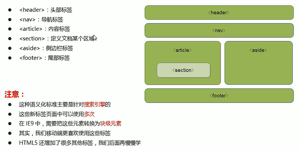
2)新增多媒体标签
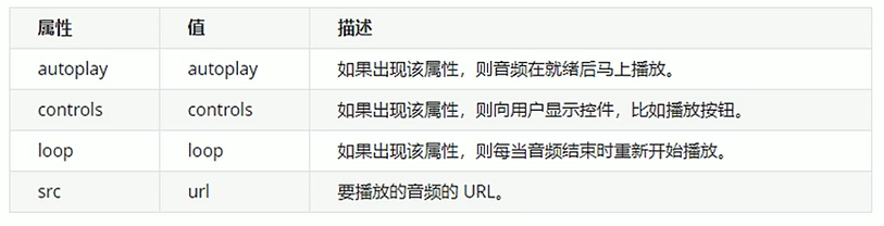
音频:<audio>
视频:<video>
(1)视频<video>
---尽量使用mp4格式
<video src="文件地址" controls="controls"></video>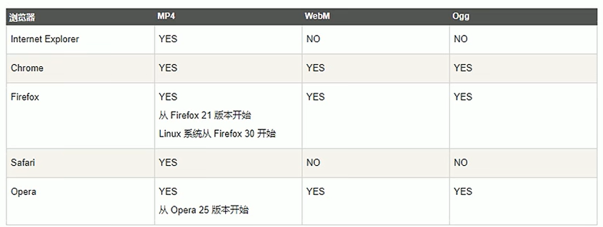
常见属性:
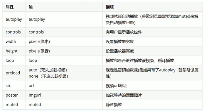
禁用autoplay解决方法:
<video src="./images/what.MP4" autoplay="autoplay" muted="muted"></video>
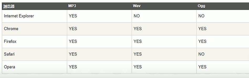
(2)音频:<audio>
语法:
<audio src="文件地址" controls="controls"></audio>
audio元素支持三种格式:
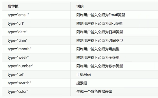
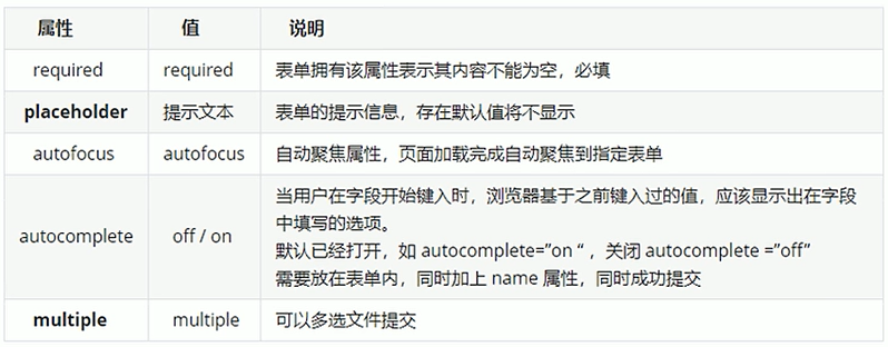
3)新增input类型
<style>/* 伪元素 */input::placeholder {color: rgb(243, 40, 8);}</style>
<body><form action=""><input type="search" name="" id="" required="required" placeholder="剑来"><input type="submit" value="提交"></form>
</body>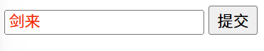
2、CSS新增特性
1)新增选择器
(1)属性选择器
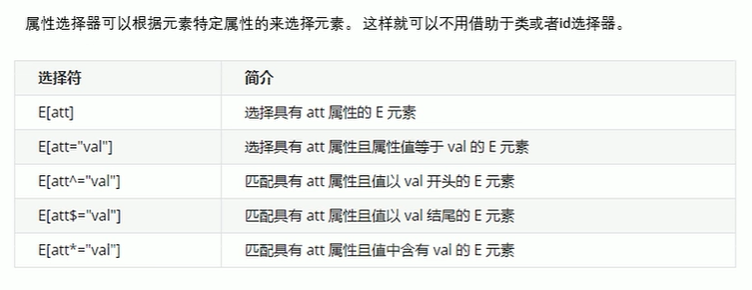
注意:类选择器、属性选择器、伪类选择器,权重为10。
<style>input[value] {color: red;}</style>
<body><input type="search" name="" id="" required="required" placeholder="剑来"><input type="submit" value="提交"></body>(2)结构伪类选择器
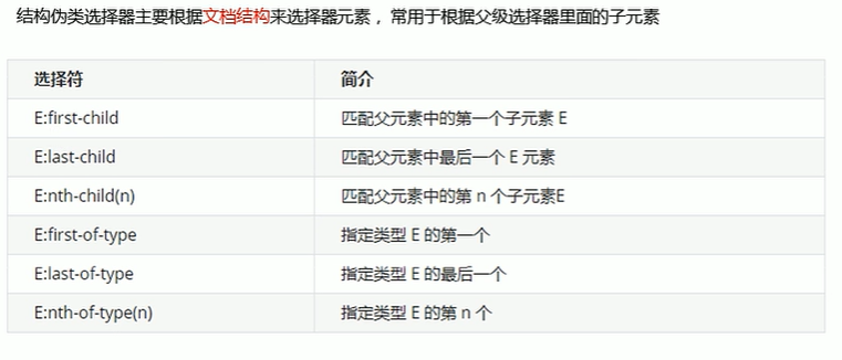
<style>ul li:first-child {background-color: skyblue;}ul li:last-child {background-color: pink;}/*nth-child(k):选择ul里的第k个li*/ul li:nth-child(5) {background-color: red;}</style>
<body><ul><li>1</li><li>2</li><li>3</li><li>4</li><li>5</li><li>6</li><li>7</li><li>8</li></ul></body>nth-child也是可以选择多个的。
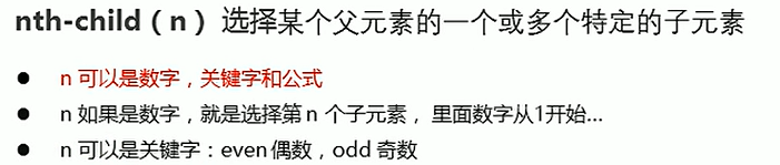
<style>ul li:nth-child(odd) {background-color: skyblue;}</style>n也可以是公式,同时,n从0开始计算,注意nth-child(0)这里面必须是n,不能是其他的字母。
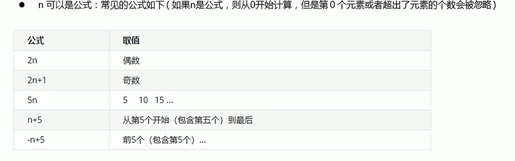
<style>/* 选择所有的li */ul li:nth-child(n) {background-color: skyblue;}ul li:nth-child(2n) {background-color: skyblue;}</style>nth-child和nth-of-type的区别
nth-child会把所有的孩子排序号,执行时先看nth-child(1)然后再往前看找标签,下面这种情况就是选不出来的。
<style>div p:nth-child(1) {background-color: skyblue;}</style>
<body><div><div>0</div><p>1</p><p>2</p><p>3</p><p>4</p><p>5</p></div></body>nth-of-type则是把指定的孩子排列序号,执行时先看标签,然后再回去看nth-of-type是第几个孩子,下面这样就可以选出来。
<style>div p:nth-of-type(1) {background-color: skyblue;}</style>(3)伪元素选择器(重点)
伪元素选择器可以帮助我们利用CSS创建新的标签元素,而不需要html标签,从而简化html结构。
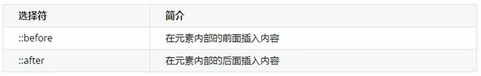
注意:
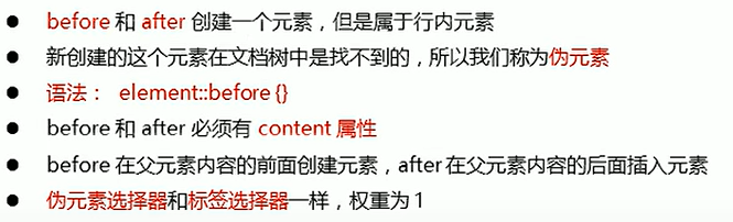
<style>div {width: 160px;height: 80px;background-color: skyblue;}div::before {content: '伪';}div::after {content: '选择器';}</style>
<body><div>元素</div>
</body>
(4)应用
a.字体图标
<link rel="stylesheet" href="//at.alicdn.com/t/c/font_5020741_sn609k3h7hh.css"><style>div {position: relative;width: 200px;height: 35px;border: 1px solid red;}div::after {position: absolute;top: 10px;right: 10px;content: '\e65e';font-family: 'iconfont';color: red;font-size: 18px;}</style>
<body><div></div>
</body>
b. 应用:土豆案例
<style>.tudou {position: relative;width: 444px;height: 320px;background-color: skyblue;margin: 30px auto;}.tudou img {width: 100%;height: 100%;}.tudou::before {content: '';display: none;position: absolute;top: 0;left: 0;width: 100%;height: 100%;background: rgba(0, 0, 0, .4) url(images/arr.png) no-repeat center center;}/* 当鼠标经过图片,mask盒子显示 */.tudou:hover::before {display: block;}</style>
<body><div class="tudou"><img src="images/tudou.jpg" alt=""></div><div class="tudou"><img src="images/tudou.jpg" alt=""></div><div class="tudou"><img src="images/tudou.jpg" alt=""></div>
</body>
c.伪元素清除浮动
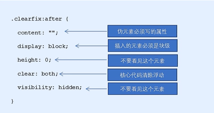
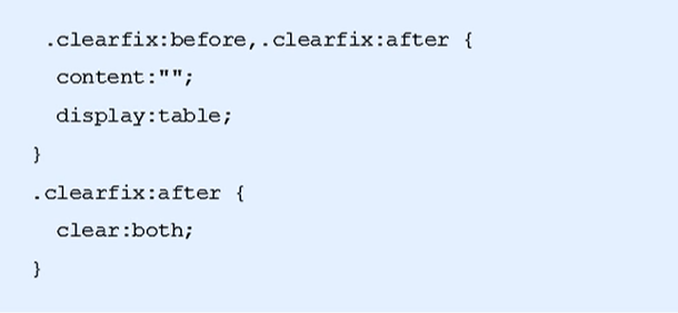
display:table;转换为块级元素并且一行显示。
2)盒子模型
如果盒子模型改为box-sizing:border-box;那么padding和border就不会撑大盒子了(前提:padding和border不会超过width宽度)
div {width: 200px;height: 200px;background-color: pink;padding: 20px;/* 此时padding已经撑大了盒子,但是如果我来个 */box-sizing: border-box;/* 就欧了 */}
因此,CSS开头可以写:
* {margin: 0;padding: 0;box-sizing: border-box;}
3)其他特性(了解)
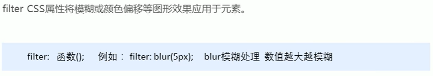
(1)图片模糊
CSS3滤镜filter:
(2)计算盒子宽度
---calc函数
width:calc(100%-80px);括号里面可以使用+ - * / 来进行计算。
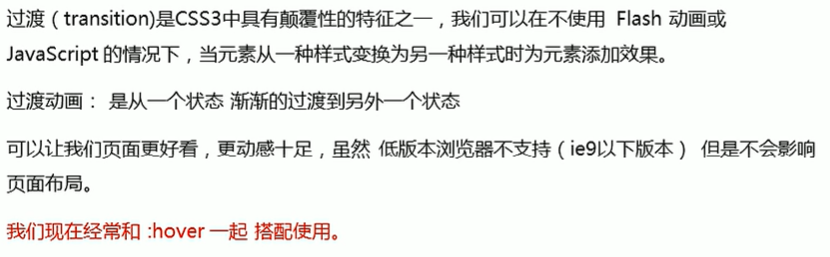
4)CSS3过渡(重点)
---类似ppt中的平滑效果
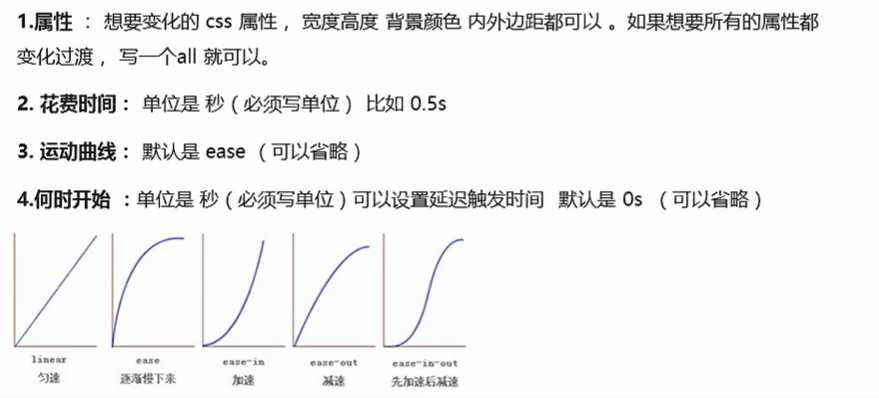
原则:谁动给谁加,也就是谁要过渡,就把transition放在谁里面
如果想同时变换多个属性,可以直接这么写:
transition: width 1s, height 1s, background-color 1s;
我们最常用的是这么写,直接变化所有:
transition: all 1s;
进度条布局示例:
<style>.bar {width: 150px;height: 15px;border: 1px solid red;border-radius: 7px;}.bar_in {width: 50%;height: 100%;background-color: red;/* 谁做过渡给谁加 */transition: all .7s;}/* 鼠标放在bar盒子上,bar_in盒子变宽 */.bar:hover .bar_in {width: 100%;}</style>
<body><div class="bar"><div class="bar_in"></div></div>
</body>


 进程基础)


)
(网络层、网段划分))
和animation(动画)——CSS)


![vue2迁移到vite[保姆级教程]](http://pic.xiahunao.cn/vue2迁移到vite[保姆级教程])
